
About
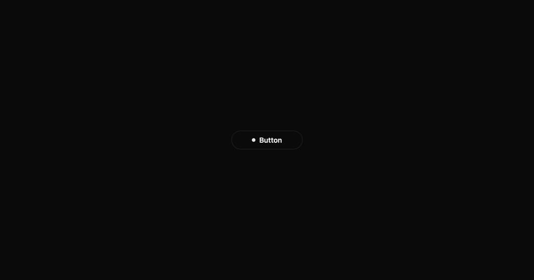
A button with expanding dot animation, loading state with spinner, and success checkmark. Multi-state interactive component.
Built with React and Tailwind. Copy the prompt and paste it into Claude Code, Cursor or Lovable: your agent adds Interactive Hover Button to your project and fits it to your theme.
Code
How Interactive Hover Button is used: the demo's code. The component's own source comes with a free account.
Usage.tsx
import InteractiveHoverButton from "../components/ui/interactive-hover-button";

export default function Demo() {
  return (
    <div className="flex items-center justify-center min-h-screen bg-background">
      <InteractiveHoverButton text="Button" />
    </div>
  );
}
Dependencies
More by Shatlyk1011
View all
Motion Button
893
3D Marquee
724
Hover Border Gradient
625
Team Member Card
575
Link Hover
295
Typing Effect
270
Animated Dropdown
231
Gradient Borders Button
226
More in Buttons
View all
Texture Button
98

Button
1
Button
68

Eclipse Button
3

Button
65

App Store Button
459

HeroUI Button Group
2
Base Button
4

