Button Components for React & Next.js
Upgrade your UI with 250 stylish button components for React, fully compatible with Tailwind CSS and Next.js frameworks.
Browse components

Texture Button
98

Button
1
Button
68

Eclipse Button
3

Button
65

App Store Button
458

HeroUI Button Group
2
Base Button
4

FlowButton
1.3K
Button Group
13
Button Save
47
Button
4

Shiny Button
2.2K
Split Button
14
Origin Button
801
not found 2
1.1K

Badge Tag
24

Empty
16
Button

Button witn Icon
1.4K
Button
26
Input
13

Glassmorphism Profile Card
461
Button
3

Icon Label Subtext Button
56
Liquid Glass Button
6.8K
Not found
378

Liquid Metal Button
3.4K
Theme Switcher
252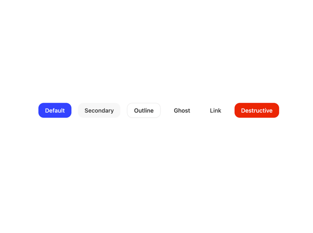

Button
32
Native Button
7
Avatar
8

Card Studio
101
Button Group
4
pricing
687
Toolbar
29

Button
15
Empty
20
HeroUI Toggle Button

Button

Cookies
6
Aero Hero-3
579
Button


Cta 4
294
One Clipboard

Pagination
91
Calendar Date Picker
54
Pagination
27


Keep browsing with a free account
See all 12,000+ components, 350 templates, 954 themes and 138 apps, save favourites and copy two prompts a day for free. No card needed
More button components
- Button by Sean Hello
- Button by shadcn
- Eclipse Button by iamsatish4564
- HeroUI Button Group by Hero Ui
- Base Button by Sean Hello
- Button Group by shadcn
- Button by James Shopland
- Empty by Cnippet
- Button by tigran tumasov
- Button by Sean Hello
- Button by shadcn
- Eclipse Button by iamsatish4564
- HeroUI Button Group by Hero Ui
- Button Group by shadcn
- Base Button by Sean Hello
- Button by tigran tumasov
- Empty by Cnippet
- Toolbar by Cnippet
- Button by Bar
- Button Group by Clevision
- Button by Wensity Labs
- Basic Toast by Abraham
- Buttons by Clevision
- Card Studio by Clevision
- Button by Sean Hello
- Button by shadcn
- HeroUI Button Group by Hero Ui
- Button Group by shadcn
- Base Button by Sean Hello
- Button by tigran tumasov
- Empty by Cnippet
- Button by Cnippet
- Button by lipa88-mk
- Toolbar by Cnippet
- Cookies by prebuiltui
- Base Input by Sean Hello
- The Item one by felipemenezes098
- Native Button by Moumen Soliman
- One Clipboard by felipemenezes098
- Card Studio by Clevision
- Button by Bar
- AI Actions by Ali Imam
- Form by prebuiltui
- Random Letter Swap CTA Buttons by Cnippet
- Pop Button by tom
- One Button by felipemenezes098
- Not Found Page by Efferd
- Signup 1 by Shadcnblocks.com
- Button by Sean Hello
- HeroUI Button Group by Hero Ui
- Base Button by Sean Hello
- Button by tigran tumasov
- Empty by Cnippet
- Button by Cnippet
- Button by Sean Hello
- Button by lipa88-mk
- Button by Bar
- Toolbar by Cnippet
- Buttons by Clevision
- Hover Glow Button by Hossain Jahed
- HeroUI Toggle Button by Hero Ui
- Navbar by Ali Imam
- Form by prebuiltui
- Interactive Hover Button by Dillion Verma
- 8-bit Button by OrcDev
- Basic Toast by Abraham
- Pricing Card With Features by Erik Erik
- Pagination Button Group by Cnippet
- FloatButton by antdesign
- Pearl Button by reuno-ui
- One Button by felipemenezes098
- Save With Progress by Waqar H. Syed
- Button by Sean Hello
- HeroUI Button Group by Hero Ui
- Base Button by Sean Hello
- Button by tigran tumasov
- Button by Cnippet
- Button with Unread Badge by Sean Hello
- Button by lipa88-mk
- Toolbar by Cnippet
- Buttons by Clevision
- Avatar by Arihant jain
- Figma File Button by ShadcnSpace
- BeUI Drawer by Saurabh
- Button Retro by Serafim
- Cookies by prebuiltui
- Button by Berat Berkay Gökdemir
- Glow Button by waiz
- HeroUI Toggle Button by Hero Ui
- Basic Avatar by Clevision
- Button by Bar
- Astryx Button Group by Astryx
- Pricing Cards by prebuiltui
- Button Download by Voxlet UI
- One Clipboard by felipemenezes098
- Hero with group of images, text and two buttons by Tommy Jepsen
- Button by Sean Hello
- Base Button by Sean Hello
- HeroUI Button Group by Hero Ui
- Button by tigran tumasov
- Button by Cnippet
- Button by lipa88-mk
- Cookies by prebuiltui
- Reshaped Button by reshaped
- Banner by Serafim
- Basic Toast by Abraham
- Banner by Dub.co
- Button by Cnippet
- Split Button by tigran tumasov
- Toast by tigran tumasov
- Empty by shadcn
- Pagination by Origin UI
- One Button by felipemenezes098
- Pricing Cards by prebuiltui
- Finger Scan Button by Ali Imam
- Button by Origin UI
- Confetti by Motion
- Expandable Button by Rushil Dhinoja
- File Upload by Sean Hello
- Tooltip by Origin UI
- Button by Sean Hello
- Base Button by Sean Hello
- HeroUI Button Group by Hero Ui
- Button by Cnippet
- Button by lipa88-mk
- Toast by tigran tumasov
- Pricing Cards by prebuiltui
- Card Studio by Clevision
- Actions by Vercel
- Button by ui layout
- Buttons by Clevision
- Button by Origin UI
- Shiny Button by jay sharma
- Pagination by Sean Hello
- Feature 1 by Shadcnblocks.com
- Toolbar by Cnippet
- One Clipboard by felipemenezes098
- Sonner by shadcn
- Native Button by Moumen Soliman
- Shiny Button by Hyperiux Vault
- One Button by felipemenezes098
- Call to Action 01 by Ali Imam
- Banner by Serafim
- Feature Modern by brijr
- Button by Sean Hello
- Base Button by Sean Hello
- Button by Cnippet
- Button by Origin UI
- Buttons by Clevision
- Button Ui by prebuiltui
- Empty by Jesus Lopez
- Sketch Button by kanchanasw
About button components
This collection gathers 764 React button components, from plain shadcn-style buttons to spotlight and floating action variants. You get primary, secondary, ghost, outline, and destructive states, plus icon buttons, loading buttons, and animated hover treatments. Many follow shadcn/ui conventions, so variants and sizes map to the props you already expect. Whether you need a simple form submit or a glowing call to action, there is a version here to start from.
Reach for a basic shadcn button when you want a neutral base you can theme; pick a spotlight or animated one when the click target needs to pull focus. Every button ships as full TSX with a live preview, so you can copy the code straight in, run npx shadcn@latest add with the registry URL, or pull it through the Magic MCP from Cursor or Claude Code. They are Tailwind-based and drop into any Next.js or React app.