
About
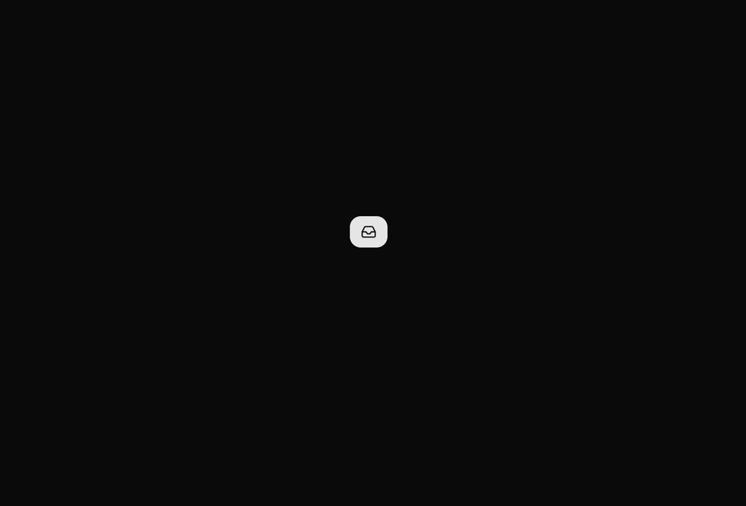
A button that smoothly transitions between collapsed and expanded states using spring animations. Shows only an icon when collapsed and reveals text alongside the icon when expanded, perfect for responsive layouts and space-saving interfaces.
Built with React and Tailwind. Copy the prompt and paste it into Claude Code, Cursor or Lovable: your agent adds Expandable Button to your project and fits it to your theme.
Code
How Expandable Button is used: the demo's code. The component's own source comes with a free account.
Usage.tsx
import { ExpandableButton } from "@/components/ui/expandable-button";
import { Inbox } from "lucide-react"


export default function DemoOne() {
  return  <div className="w-full px-10 flex items-center justify-center">
      <ExpandableButton icon={<Inbox className="w-5 h-5" />}>
        Inbox
      </ExpandableButton>
    </div>
}
Dependencies
More by Rushil Dhinoja
View all

Morphing Square
442
Voice Input
316
Warp Dialog
270
Orbital Loader
211
Bouncing Dots
195
Vignette Grid Background
192
Wave Loader
133
Discussion
85
More in Buttons
View all
Texture Button
98

Button
1
Button
68

Button
65

Eclipse Button
3
Button Group
14
Base Button
4

App Store Button
459

