
About
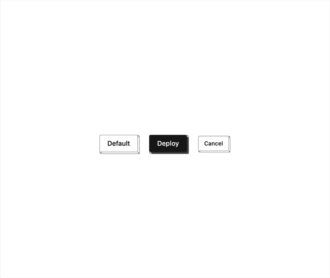
A button rendered as a pressable isometric block that visually sinks into its own depth when clicked, with solid, outline and default face styles.
Built with React and Tailwind. Copy the prompt and paste it into Claude Code, Cursor or Lovable: your agent adds Iso Button to your project and fits it to your theme.
Code
How Iso Button is used: the demo's code. The component's own source comes with a free account.
Usage.tsx
import { IsoButton } from "@/components/ui/iso-button";

export default function IsoButtonDemo() {
  return (
    <div className="flex min-h-[320px] w-full items-center justify-center gap-6 bg-background p-10 text-foreground">
      <IsoButton>Default</IsoButton>
      <IsoButton variant="solid">Deploy</IsoButton>
      <IsoButton variant="outline" size="sm" depth={3}>
        Cancel
      </IsoButton>
    </div>
  );
}
Dependencies
More by abhishek-mallick
View all
Isometric Bars Chart
18
Chest
10
Keys
10
Rack
9
Nodes
9
Isometric Laptop
8
Isometric Cube
8
Stack
6
More in Buttons
View all
Texture Button
98

Button
1
Button
68

Button
65

Eclipse Button
3
Button Group
14
Base Button
4

App Store Button
459

