
About
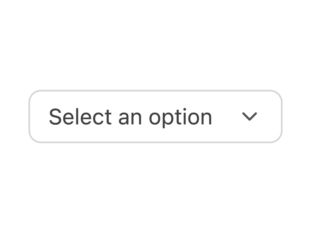
A small borderless icon/text button styled for use inside form fields like comboboxes, date pickers, and number steppers.
Built with React and Tailwind. Copy the prompt and paste it into Claude Code, Cursor or Lovable: your agent adds Field Button to your project and fits it to your theme.
Code
How Field Button is used: the demo's code. The component's own source comes with a free account.
Usage.tsx
import { FieldButton } from "@/components/ui/tailwind-fieldbutton";
import { ChevronDown } from "lucide-react";

export default function FieldButtonDemo() {
  return (
    <div className="flex items-center gap-2 rounded-md border border-neutral-300 bg-white px-2 py-1 dark:border-neutral-700 dark:bg-neutral-900">
      <span className="px-1 text-sm text-neutral-700 dark:text-neutral-300">
        Select an option
      </span>
      <FieldButton aria-label="Open menu">
        <ChevronDown className="h-4 w-4" />
      </FieldButton>
    </div>
  );
}
Dependencies
More by py_ets
View all
Alert Dialog
12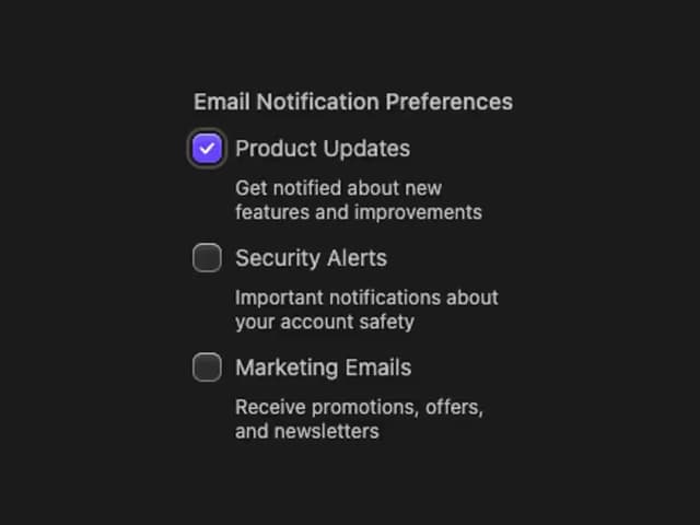
React Aria CheckboxGroup
9
Command Palette
7
React Aria DatePicker
6
Progress Bar
6
React Aria Tree
4
React Aria Switch
4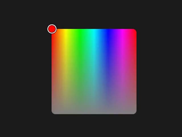
React Aria ColorArea
4
More in Buttons
View all
Texture Button
98

Button
1
Button
68

Button
65

Eclipse Button
3
Button Group
14
Base Button
4

App Store Button
459

