
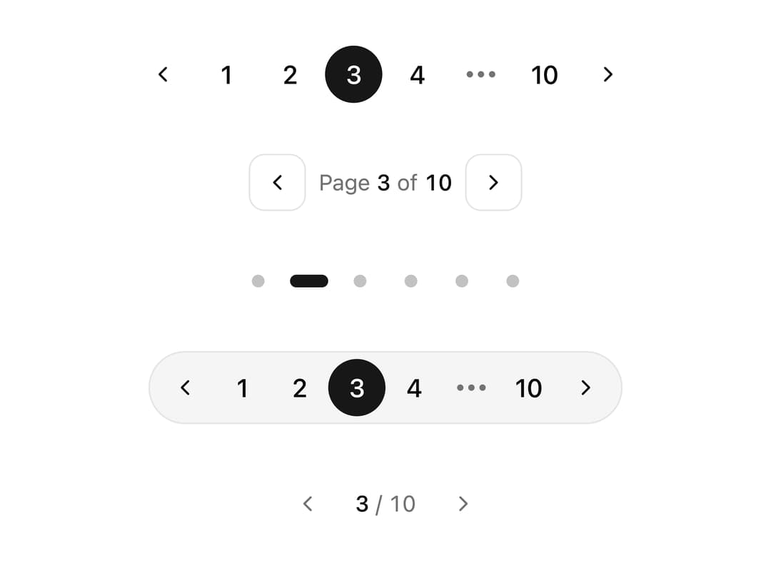
About
A set of five decorative, animated pagination controls (numbered, arrows, dots, pills, minimal) for paging through lists, tables or carousels, with a sliding active-page highlight and reduced-motion support.
Built with React and Tailwind. Copy the prompt and paste it into Claude Code, Cursor or Lovable: your agent adds Styled Pagination to your project and fits it to your theme.
Code
How Styled Pagination is used: the demo's code. The component's own source comes with a free account.
Usage.tsx
import {
  NumberedPagination,
  ArrowsPagination,
  DotsPagination,
  PillPagination,
  MinimalPagination,
} from "@/components/ui/pagination-styled";

export default function PaginationStyledDemo() {
  return (
    <div className="flex w-full flex-col items-center justify-center gap-8 p-10">
      <NumberedPagination total={10} defaultPage={3} />
      <ArrowsPagination total={10} defaultPage={3} />
      <DotsPagination total={6} defaultPage={2} />
      <PillPagination total={10} defaultPage={3} />
      <MinimalPagination total={10} defaultPage={3} />
    </div>
  );
}
Dependencies
More by ai 2
View all
Ripple Buttons
31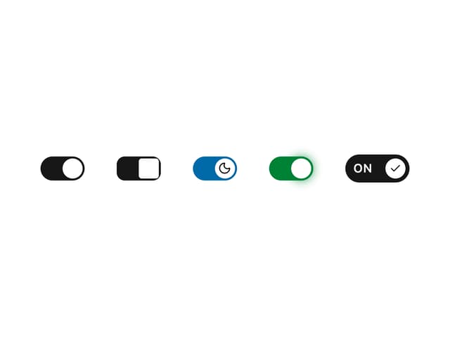
Styled Toggle Switches
17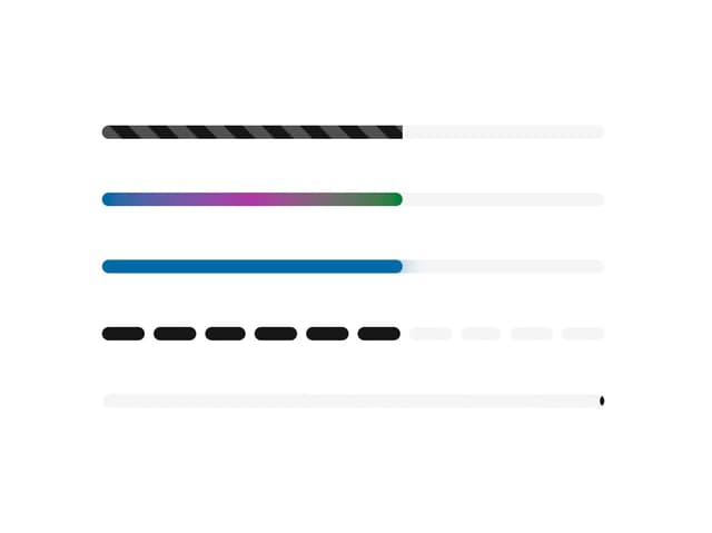
Styled Progress Bars
15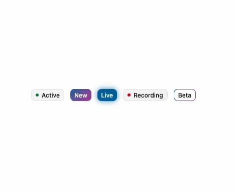
Styled Badges
10
Particle Toggles
9
OTP Pin Input
8
Combo Kbd
7
Shapes Skeleton
6
More in Navigation
View all

Sidebar
296

Progress Bar Stepper
45
Tabs
16
Navbar
1
Breadcrumb
103

Capsule Tabs
21
Pagination
27
Pagination with Ellipsis
18
