
About
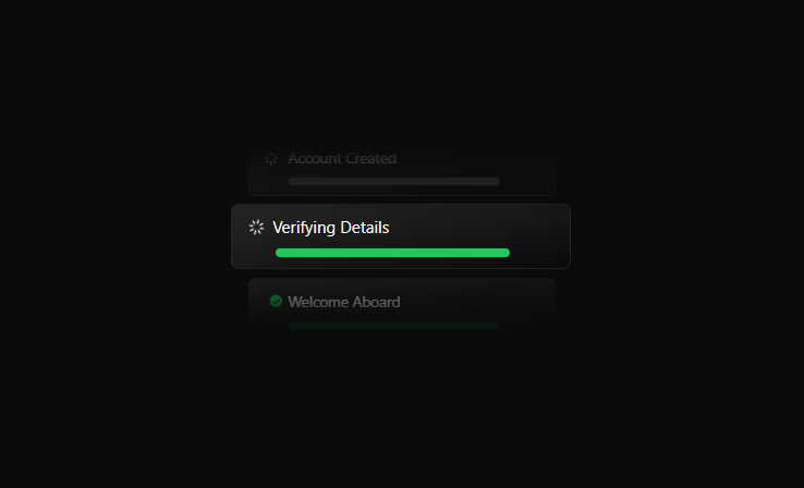
Animated onboarding progress card showing three steps with visual loaders, transitions, and completion indicators.
Built with React and Tailwind. Copy the prompt and paste it into Claude Code, Cursor or Lovable: your agent adds Onboard Card to your project and fits it to your theme.
Code
How Onboard Card is used: the demo's code. The component's own source comes with a free account.
Usage.tsx
// visit https://forgeui.in for more such components

import OnboardCard from '@/components/ui/onboard-card';

const Demo = () => {
  return (
       <OnboardCard
      duration={3000} // 3sec
      step1="Welcome Aboard"
      step2="Verifying Details"
      step3="Account Created"
    />
  )
}

export default Demo
Dependencies
More by Aman Shakya
View all

Velaris
2.1K
Auralis
322
Text Morph
236
Cloudscape
151
Chromatic Fluid
53
Vault Lock
20
Stack Ripple
13
Notification Panel
2
More in Cards
View all

Course Design Cards
1.1K

Interactive Tech Stack Bento Grid with Hover Effects
223
Stats cards with links
84

Statistics Card 7
301

Card Studio
10
Statistics Card 2
276

Weather Card
59
Card
56
