
About
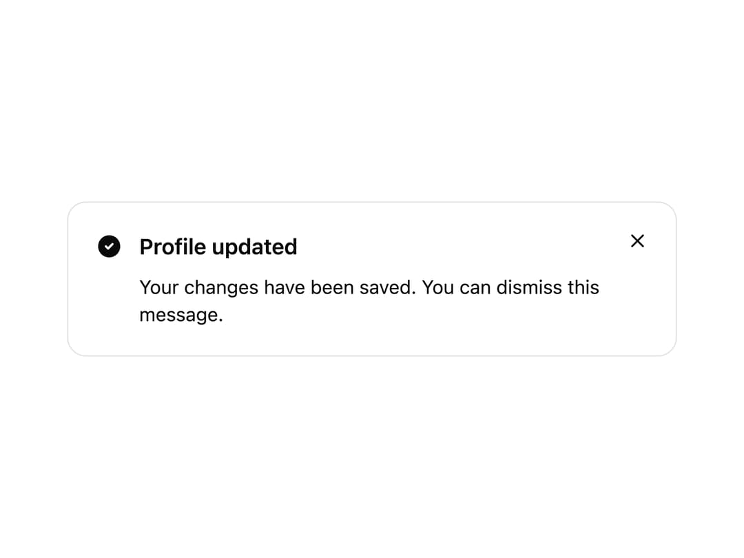
A dismissible alert banner for surfacing status messages, warnings, or announcements with an icon, title, description, and optional actions.
Built with React and Tailwind. Copy the prompt and paste it into Claude Code, Cursor or Lovable: your agent adds Alert to your project and fits it to your theme.
Code
How Alert is used: the demo's code. The component's own source comes with a free account.
Usage.tsx
import {
  Alert,
  AlertIcon,
  AlertTitle,
  AlertDescription,
} from "@/components/ui/alert";
import { CircleCheckFilled } from "@appica/icons-react";

export default function AlertDismissible() {
  return (
    <div className="w-full max-w-md">
      <Alert variant="success" dismissible>
        <AlertIcon>
          <CircleCheckFilled />
        </AlertIcon>
        <AlertTitle>Profile updated</AlertTitle>
        <AlertDescription>
          Your changes have been saved. You can dismiss this message.
        </AlertDescription>
      </Alert>
    </div>
  );
}
Dependencies
More by appica-dev
View all
Border Beam
53
Text Animate
19
Carousel
14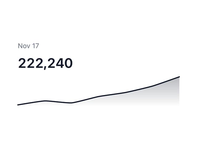
Sparkline
7
Avatar
7
Table of Contents
6
Color Area
6
Background Pattern
6
More in Buttons
View all
Texture Button
98

Button
1
Button
68

Eclipse Button
3

Button
65

App Store Button
459

HeroUI Button Group
2
Base Button
4

