
About
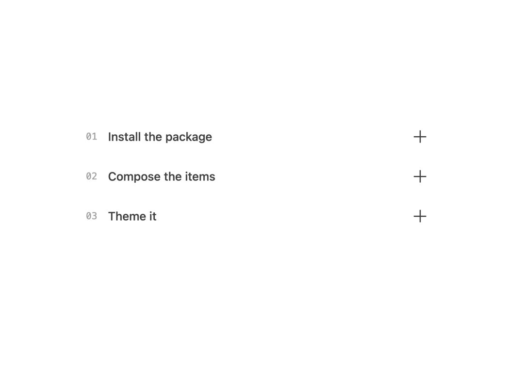
A borderless, minimal accordion with a plus/cross toggle indicator and numbered items, for FAQs or step-by-step guides.
Built with React and Tailwind. Copy the prompt and paste it into Claude Code, Cursor or Lovable: your agent adds Ghost Accordion to your project and fits it to your theme.
Code
How Ghost Accordion is used: the demo's code. The component's own source comes with a free account.
Usage.tsx
import AccordionGhost from "@/components/ui/accordion-ghost";

export default function AccordionGhostDemo() {
  return (
    <div className="w-full max-w-lg mx-auto p-10">
      <AccordionGhost />
    </div>
  );
}
More by Arihant jain
View all
Footer section
1.9K
Multistep Form
714
Animated Drawer
695
Status Badge
521
Stacked Circular Footer
429
Input Modal
335
Large Name Footer
200
Profile Dropdown
197