
About
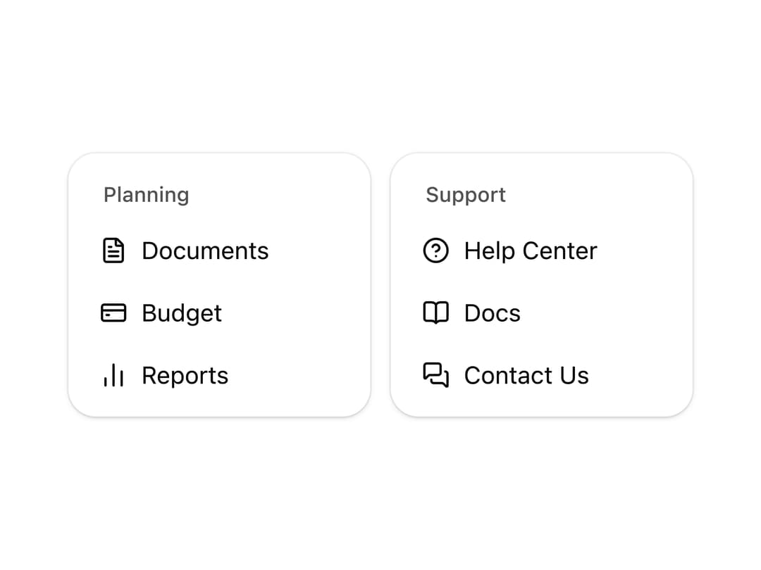
A compact navigation card that lists links or actions with icons and a spring slide animation on hover.
Built with React and Tailwind. Copy the prompt and paste it into Claude Code, Cursor or Lovable: your agent adds Nav List Card to your project and fits it to your theme.
Code
How Nav List Card is used: the demo's code. The component's own source comes with a free account.
Usage.tsx
"use client";

import { NavListCard, SUPPORT_NAV_ITEMS } from "@/components/ui/nav-list-card";

export default function NavListCardDemo() {
  return (
    <div className="flex w-full justify-center py-8">
      <div className="grid w-full max-w-[360px] grid-cols-2 items-start gap-3">
        <NavListCard />
        <NavListCard title="Support" items={SUPPORT_NAV_ITEMS} />
      </div>
    </div>
  );
}
Dependencies
More by Arihant jain
View all
Footer section
1.9K
Multistep Form
714
Animated Drawer
695
Status Badge
521
Stacked Circular Footer
429
Input Modal
335
Large Name Footer
200
Profile Dropdown
197
More in Cards
View all

Course Design Cards
1.1K

Interactive Tech Stack Bento Grid with Hover Effects
223
Stats cards with links
84

Statistics Card 7
301

Card Studio
10
Statistics Card 2
276

Weather Card
59
Card
56
