
About
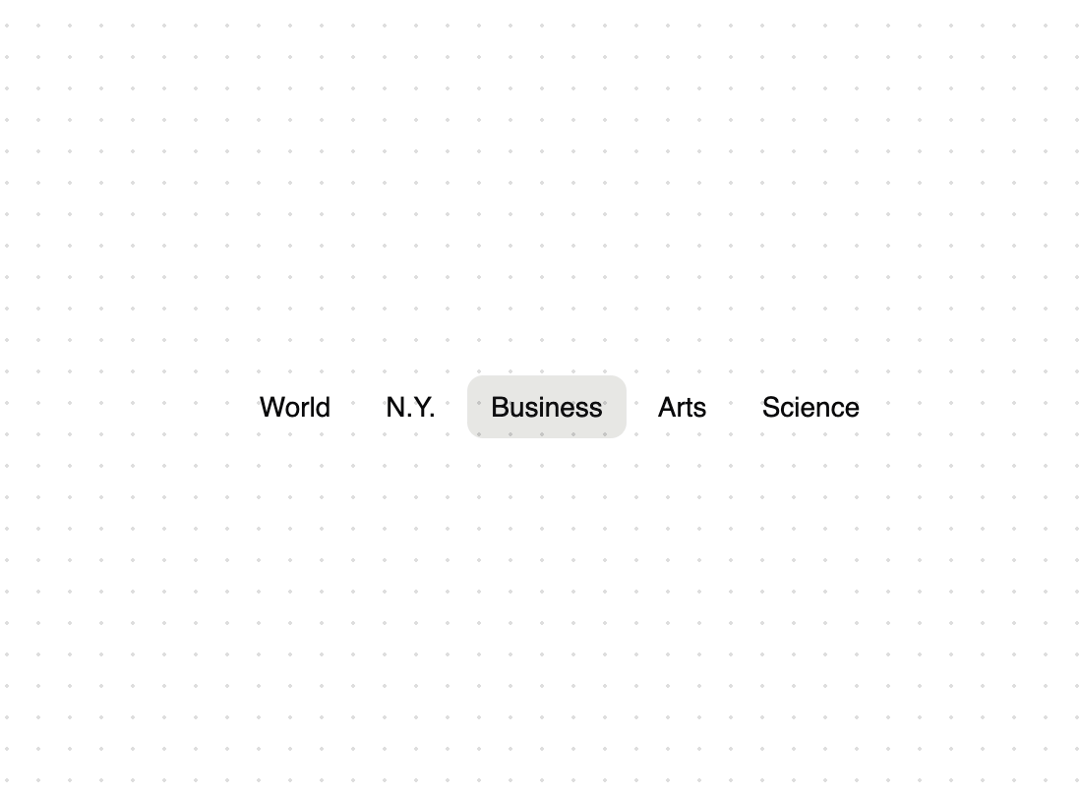
An animated tab component built with Framer Motion's layoutId prop.
Built with React and Tailwind. Copy the prompt and paste it into Claude Code, Cursor or Lovable: your agent adds Animated Tabs to your project and fits it to your theme.
Code
How Animated Tabs is used: the demo's code. The component's own source comes with a free account.
Usage.tsx
"use client";

import { AnimatedTabs } from "@/components/ui/animated-tabs";

const tabs = [
  { id: "world", label: "World" },
  { id: "ny", label: "N.Y." },
  { id: "business", label: "Business" },
  { id: "arts", label: "Arts" },
  { id: "science", label: "Science" },
];

function TabsDemo() {
  return (
    <div className="flex min-h-[100px] w-full items-center justify-center p-4">
      <AnimatedTabs
        tabs={tabs}
        onChange={(tabId) => console.log("Tab changed:", tabId)}
      />
    </div>
  );
}

export default { TabsDemo };
Dependencies
More by Build UI
View all
Filesystem Item
582
Animated Text
214
Animated Counter
80
Slider
56
iOS Animated Switch
6
More in Navigation
View all

Sidebar
296

Progress Bar Stepper
44
Tabs
16
Navbar
1
Breadcrumb
103

Capsule Tabs
21
Pagination
27
Pagination with Ellipsis
18
