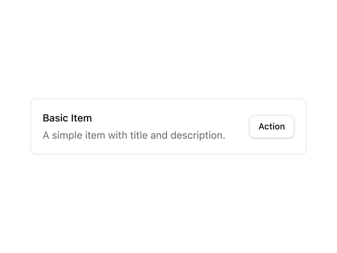
About
A compact content row that pairs a title and description with trailing action buttons, useful for lists of settings, notifications, or selectable options.
Built with React and Tailwind. Copy the prompt and paste it into Claude Code, Cursor or Lovable: your agent adds Basic Item to your project and fits it to your theme.
Code
How Basic Item is used: the demo's code. The component's own source comes with a free account.
Usage.tsx
import ItemComponent from "@/components/ui/item1";

export default function ItemDemo() {
  return <ItemComponent />;
}
More by Bundui.io
View all

Fluid particles background
780
Floating paths
658
Text Gradient Scroll
621
Stars
545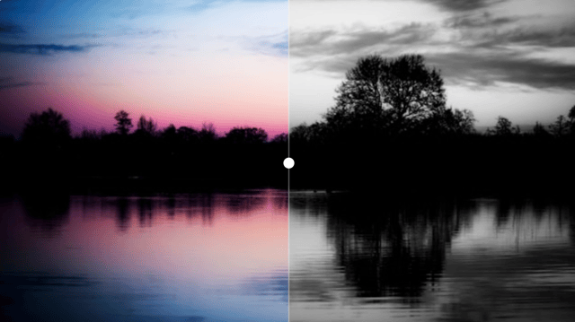
Image Comparison
429
Magnetic Button
404
Marquee Effect
323
Wavy
201
More in Cards
View all

Course Design Cards
1.1K

Interactive Tech Stack Bento Grid with Hover Effects
227
Stats cards with links
84

Statistics Card 7
301

Card Studio
10
Statistics Card 2
276

Weather Card
59
Card
56
