About
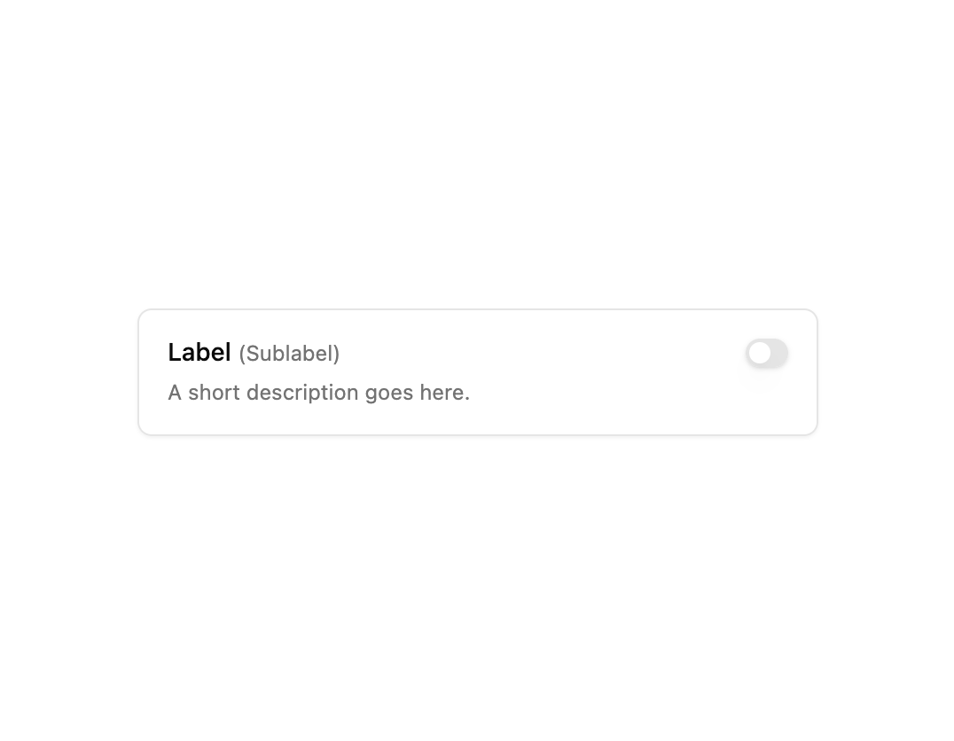
A toggle switch inside a bordered card with a label, sublabel, and short description, with the border highlighting when checked.
Built with React and Tailwind. Copy the prompt and paste it into Claude Code, Cursor or Lovable: your agent adds Switch with Label and Description to your project and fits it to your theme.
Code
How Switch with Label and Description is used: the demo's code. The component's own source comes with a free account.
Usage.tsx
import SwitchComponent from "@/components/ui/switch10";

export default function Demo() {
  return (
    <div className="flex min-h-64 w-full items-center justify-center p-6">
      <div className="w-full max-w-sm">
        <SwitchComponent />
      </div>
    </div>
  );
}
More by Bundui.io
View all

Fluid particles background
780
Floating paths
658
Text Gradient Scroll
621
Stars
545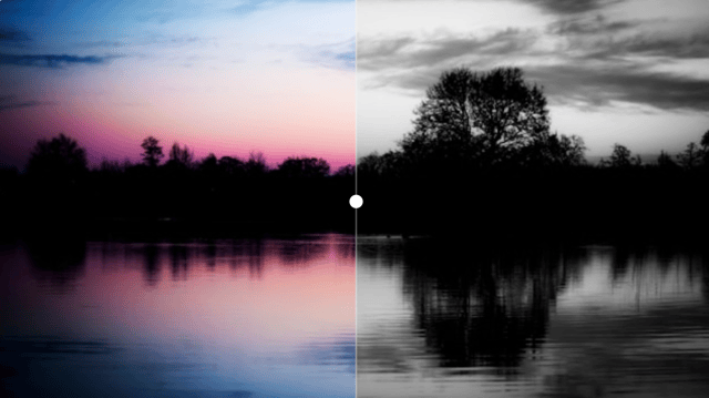
Image Comparison
429
Magnetic Button
404
Marquee Effect
323
Wavy
201
More in Forms
View all

Contact Card
1K

Premium Auth
525

Login 2
8

Form
16

Card Studio
41

HeroUI Field Error
10

Book A Demo 1
74
Book A Demo 3
90