
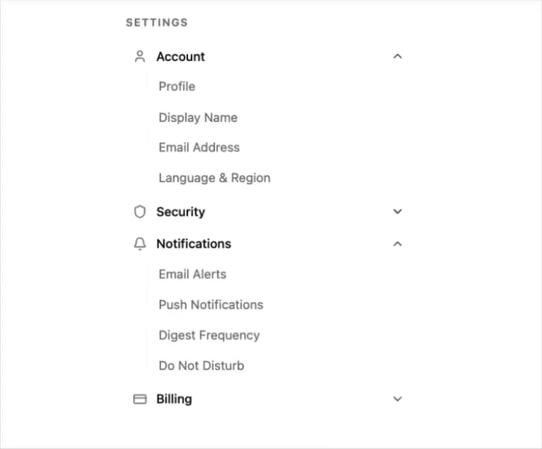
About
A settings sidebar navigation built from an accordion, with icon-labeled sections that expand to reveal grouped links.
Built with React and Tailwind. Copy the prompt and paste it into Claude Code, Cursor or Lovable: your agent adds Settings Sidebar Accordion to your project and fits it to your theme.
Code
How Settings Sidebar Accordion is used: the demo's code. The component's own source comes with a free account.
Usage.tsx
import Pattern from "@/components/ui/settings-sidebar-accordion";

export default function Default() {
  return (
    <div className="flex min-h-[420px] w-full items-center justify-center p-6">
      <Pattern />
    </div>
  );
}
Dependencies
More by Cnippet
View all

Team
1.3K
Davincho Hero-1
686
Aero Hero-3
583
Features
516
Random Letter Swap Navigation
505
Services with Animated Hover Modal
470
Blogs
398
Aero Hero-1
364
More in Navigation
View all

Sidebar
305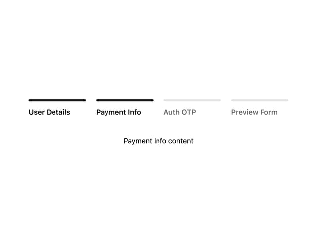

Progress Bar Stepper
46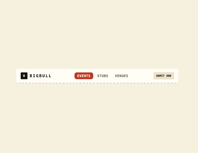
Navbar
1

Breadrcrumb
24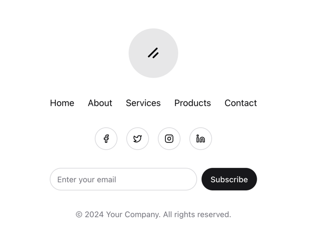
Stacked Circular Footer
431
Tabs
17
Pagination with Icon and Label
17
Navbar with Theme Toggle
46

