
About
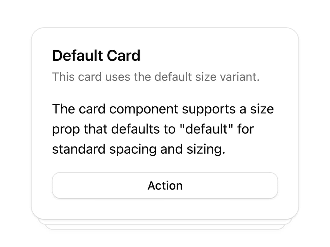
A card with a layered stacked-depth effect created by offset panels behind it, with header, content and footer sections.
Built with React and Tailwind. Copy the prompt and paste it into Claude Code, Cursor or Lovable: your agent adds Stacked Depth Card to your project and fits it to your theme.
Code
How Stacked Depth Card is used: the demo's code. The component's own source comes with a free account.
Usage.tsx
import Pattern from "@/components/ui/v-card-9";

export default function Default() {
  return (
    <div className="flex min-h-svh w-full items-center justify-center p-12">
      <Pattern />
    </div>
  );
}
More by Cnippet
View all

Team
1.3K
Davincho Hero-1
686
Aero Hero-3
580
Features
515
Random Letter Swap Navigation
501
Services with Animated Hover Modal
470
Blogs
398
Aero Hero-1
364
More in Cards
View all

Course Design Cards
1.1K

Interactive Tech Stack Bento Grid with Hover Effects
223
Stats cards with links
84

Statistics Card 7
301

Card Studio
10
Statistics Card 2
276

Weather Card
59
Card
56
