
About
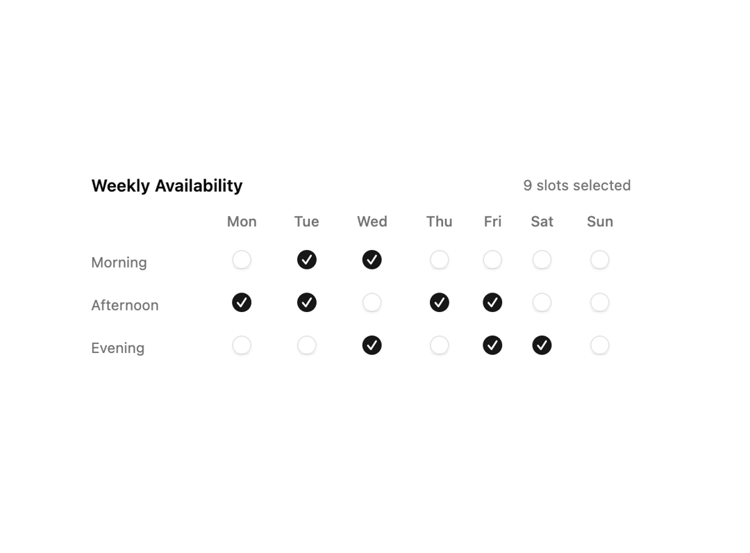
A weekly availability grid with a checkbox for each day and time slot that tracks how many slots are selected.
Built with React and Tailwind. Copy the prompt and paste it into Claude Code, Cursor or Lovable: your agent adds Weekly Availability Checkbox Grid to your project and fits it to your theme.
Code
How Weekly Availability Checkbox Grid is used: the demo's code. The component's own source comes with a free account.
Usage.tsx
"use client";

import { useId, useState } from "react";
import { Checkbox } from "@/components/ui/v-checkbox-11-utils/checkbox";

const COLUMNS = ["Mon", "Tue", "Wed", "Thu", "Fri", "Sat", "Sun"];
const ROWS = ["Morning", "Afternoon", "Evening"];

type Grid = Record<string, boolean>;

const INITIAL: Grid = {
  "Morning-Mon": true,
  "Morning-Tue": true,
  "Morning-Wed": true,
  "Afternoon-Tue": true,
  "Afternoon-Thu": true,
  "Afternoon-Fri": true,
  "Evening-Wed": true,
  "Evening-Fri": true,
  "Evening-Sat": true,
};

function key(row: string, col: string) {
  return `${row}-${col}`;
}

function Pattern() {
  const id = useId();
  const [grid, setGrid] = useState<Grid>(() =>
    Object.fromEntries(
      ROWS.flatMap((r) =>
        COLUMNS.map((c) => [key(r, c), !!INITIAL[key(r, c)]]),
      ),
    ),
  );

  const toggle = (k: string) => setGrid((prev) => ({ ...prev, [k]: !prev[k] }));

  const count = Object.values(grid).filter(Boolean).length;

  return (
    <div className="w-full max-w-md space-y-3">
      <div className="flex items-center justify-between">
        <p className="font-semibold text-sm">Weekly Availability</p>
        <span className="text-muted-foreground text-xs">
          {count} slots selected
        </span>
      </div>
      <div className="overflow-x-auto">
        <table className="w-full border-collapse text-xs">
          <thead>
            <tr>
              <th className="w-24 pb-2 text-left font-medium text-muted-foreground" />
              {COLUMNS.map((col) => (
                <th
                  className="pb-2 text-center font-medium text-muted-foreground"
                  key={col}
                >
                  {col}
                </th>
              ))}
            </tr>
          </thead>
          <tbody>
            {ROWS.map((row) => (
              <tr key={row}>
                <td className="py-2 pr-3 text-muted-foreground">{row}</td>
                {COLUMNS.map((col) => {
                  const k = key(row, col);
                  return (
                    <td className="py-2 text-center" key={col}>
                      <Checkbox
                        checked={grid[k]}
                        id={`${id}-${k}`}
                        onCheckedChange={() => toggle(k)}
                      />
                    </td>
                  );
                })}
              </tr>
            ))}
          </tbody>
        </table>
      </div>
    </div>
  );
}

export default function Default() {
  return (
    <div className="flex min-h-svh w-full items-center justify-center p-8">
      <Pattern />
    </div>
  );
}
More by Cnippet
View all

Team
1.3K
Davincho Hero-1
688
Aero Hero-3
584
Features
516
Random Letter Swap Navigation
505
Services with Animated Hover Modal
470
Blogs
398
Aero Hero-1
364
More in Forms
View all

Premium Auth
527

Contact Card
1K
Login Card
28

Book A Demo 1
76

Login 1
54

Login Card
33

Split Sign In Form
63
Price Range Slider
226

