
About
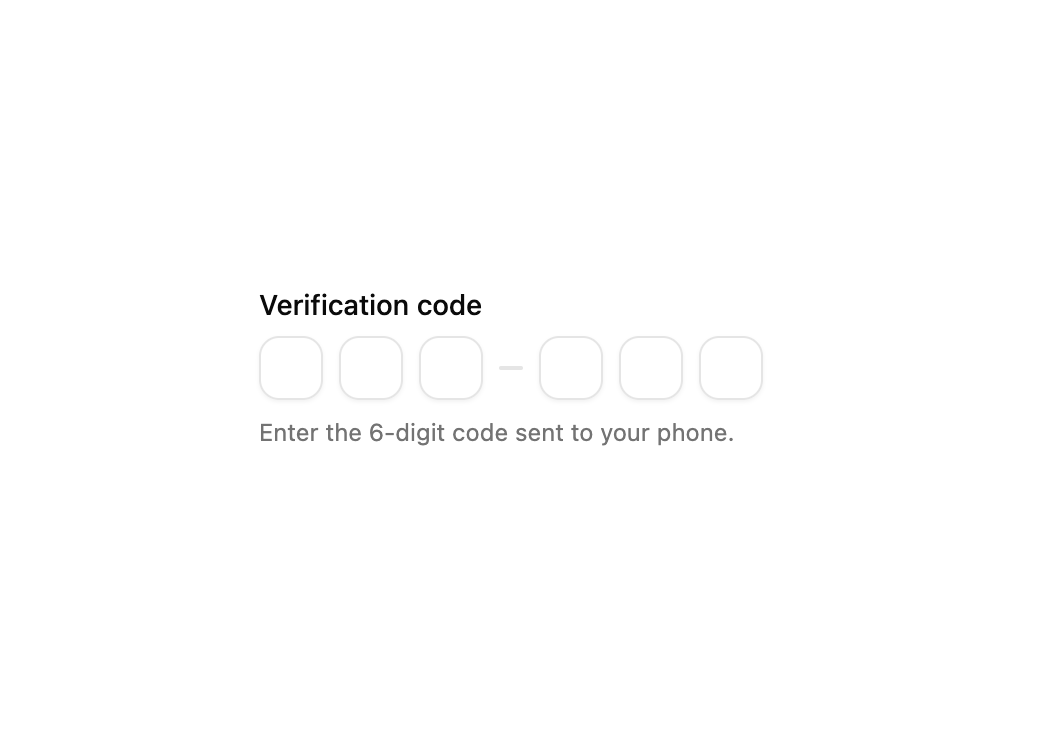
A form field with a six-digit one-time passcode (OTP) input, separator, helper description and validation error message for verification flows.
Built with React and Tailwind. Copy the prompt and paste it into Claude Code, Cursor or Lovable: your agent adds OTP Verification Field to your project and fits it to your theme.
Code
How OTP Verification Field is used: the demo's code. The component's own source comes with a free account.
Usage.tsx
import Particle from "@/components/ui/v-field-20";

export default function Default() {
  return (
    <div className="flex min-h-svh w-full items-center justify-center p-6">
      <Particle />
    </div>
  );
}
More by Cnippet
View all

Team
1.3K
Davincho Hero-1
686
Aero Hero-3
580
Features
515
Random Letter Swap Navigation
501
Services with Animated Hover Modal
470
Blogs
398
Aero Hero-1
364
More in Forms
View all

Contact Card
1K

Premium Auth
525

Login 2
8

Form
16

Card Studio
41

HeroUI Field Error
10

Book A Demo 1
74
Book A Demo 3
90