
About
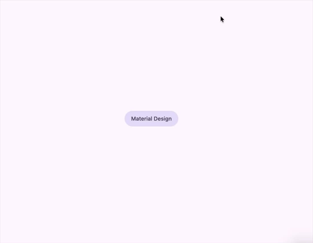
A press-ripple button with Material 3 Expressive variants (filled, tonal, elevated, outlined, text), sizes, round/square shapes and icon-only widths, for shadcn/ui + Tailwind apps.
Built with React and Tailwind. Copy the prompt and paste it into Claude Code, Cursor or Lovable: your agent adds M3 Expressive Button to your project and fits it to your theme.
Code
How M3 Expressive Button is used: the demo's code. The component's own source comes with a free account.
Usage.tsx
import { Button } from "@/components/ui/button";

export default function Demo() {
  return (
    <Button
      variant="tonal"
      render={
        <a href="https://m3.material.io" target="_blank" rel="noreferrer">
          Material Design
        </a>
      }
      nativeButton={false}
    />
  );
}
Dependencies
More by crysta1221
View all
Attachment
15
More in Buttons
View all
Texture Button
98

Button
1
Button
68

Eclipse Button
3

Button
65

App Store Button
459

HeroUI Button Group
2
Base Button
4

