About
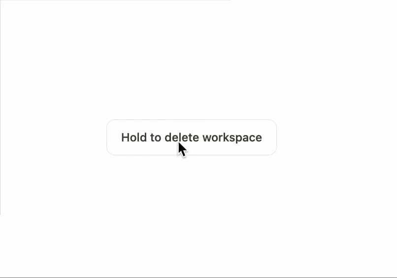
A press-and-hold button that sweeps a progress fill and only fires its confirm callback after the full hold completes, guarding destructive actions against accidental clicks.
Built with React and Tailwind. Copy the prompt and paste it into Claude Code, Cursor or Lovable: your agent adds Hold to Confirm to your project and fits it to your theme.
Code
How Hold to Confirm is used: the demo's code. The component's own source comes with a free account.
Usage.tsx
"use client";

import { HoldToConfirm } from "@/components/ui/hold-to-confirm";

export default function HoldToConfirmDemo() {
  return (
    <div className="flex min-h-[220px] items-center justify-center">
      <HoldToConfirm onConfirm={() => {}} confirmLabel="Workspace deleted">
        Hold to delete workspace
      </HoldToConfirm>
    </div>
  );
}
Dependencies
More by Özer
View all

Password Strength
1.3K
OTP Input
826
Loading Button
617
Progress Bar
594
Reorder List
318
Task Steps
286
Reading Progress
176
Press Depth
160
More in Buttons
View all
Texture Button
98

Button
1
Button
68

Button
65

Eclipse Button
3
Base Button
4

HeroUI Button Group
2

App Store Button
460

