
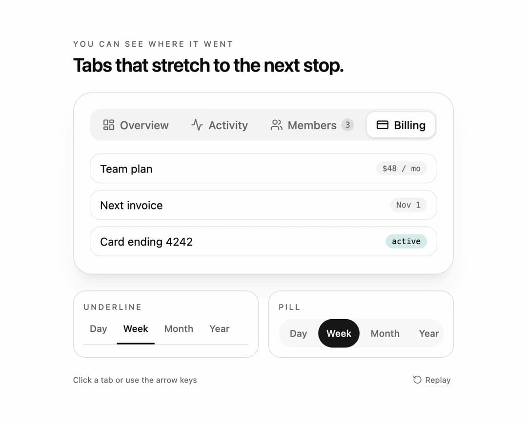
Stretch tabs for React and Tailwind CSS (shadcn/ui) that move the active indicator with a squash-and-stretch motion: it first grows to cover both the old and the new tab, then snaps to the target width. It is built to make the direction of a tab change readable at a glance, even on a dense settings bar. Stretch tabs are a tabs component whose indicator animates its offset and width through an intermediate union keyframe; this one measures the tabs with offsetLeft and offsetWidth, animates with the Web Animations API, exposes the travel direction, and slides or fades the panel the same way. Ships underline, pill and segmented-control variants, icons and count badges, controlled and uncontrolled value, a stretch amount from 0 to 1, duration, arrow key, Home and End navigation with roving tabindex, full ARIA tabs semantics, re-measuring on resize, and a reduced motion fallback. Use it for settings pages, dashboards, date range pickers and filter bars. The included demo cycles three tab sets and makes no requests. Requires React only, with no animation library.
Built with React and Tailwind. Copy the prompt and paste it into Claude Code, Cursor or Lovable: your agent adds Stretch Tabs to your project and fits it to your theme.
Code
How Stretch Tabs is used: the demo's code. The component's own source comes with a free account.
Usage.tsx
"use client";

import * as React from "react";
import { Activity, CreditCard, LayoutDashboard, RotateCcw, Users } from "lucide-react";
import { StretchTabs } from "@/components/ui/stretch-tabs";
import type { StretchTabItem } from "@/components/ui/stretch-tabs";

type DemoProps = { autoplay?: boolean; bare?: boolean; variant?: "underline" | "pill" | "segment"; stretch?: number; panel?: "slide" | "fade" | "none" };

const Row = ({ label, meta, tone }: { label: string; meta: string; tone?: string }) => (
  <li className="flex items-center justify-between rounded-xl border border-border/70 px-3 py-2 text-sm"><span>{label}</span><span className={`rounded-full px-2 py-0.5 font-mono text-[10px] ${tone ?? "bg-muted text-muted-foreground"}`}>{meta}</span></li>
);

const ITEMS: StretchTabItem[] = [
  { value: "overview", label: "Overview", icon: <LayoutDashboard className="size-4" aria-hidden="true" />, content: <ul className="space-y-2"><Row label="Monthly active users" meta="12.4k" tone="bg-chart-2/15 text-foreground" /><Row label="Projects shipped" meta="38" /><Row label="Open incidents" meta="0" /></ul> },
  { value: "activity", label: "Activity", icon: <Activity className="size-4" aria-hidden="true" />, content: <ul className="space-y-2"><Row label="Maria deployed api v2.4" meta="2m ago" /><Row label="Jon merged #412" meta="18m ago" /><Row label="Nightly build passed" meta="1h ago" tone="bg-chart-2/15 text-foreground" /></ul> },
  { value: "members", label: "Members", badge: 3, icon: <Users className="size-4" aria-hidden="true" />, content: <ul className="space-y-2"><Row label="Maria Lopez" meta="owner" /><Row label="Jon Park" meta="editor" /><Row label="3 invites pending" meta="pending" tone="bg-chart-2/15 text-foreground" /></ul> },
  { value: "billing", label: "Billing", icon: <CreditCard className="size-4" aria-hidden="true" />, content: <ul className="space-y-2"><Row label="Team plan" meta="$48 / mo" /><Row label="Next invoice" meta="Nov 1" /><Row label="Card ending 4242" meta="active" tone="bg-chart-2/15 text-foreground" /></ul> },
];

const SMALL = [
  { value: "day", label: "Day" }, { value: "week", label: "Week" }, { value: "month", label: "Month" }, { value: "year", label: "Year" },
];

const SCRIPT: [number, string][] = [[700, "activity"], [1700, "billing"], [3000, "members"], [4300, "overview"], [5500, "billing"]];
const SMALL_SCRIPT: [number, string][] = [[1200, "month"], [2600, "day"], [4000, "year"], [5200, "week"]];

export default function StretchTabsDemo({ autoplay = true, bare = false, variant = "segment", stretch = 1, panel = "slide" }: DemoProps) {
  const [main, setMain] = React.useState("overview");
  const [small, setSmall] = React.useState("week");
  const [pill, setPill] = React.useState("week");
  const [motion, setMotion] = React.useState({ ready: false, reduced: true });
  const [run, setRun] = React.useState(0);
  const [paused, setPaused] = React.useState(false);

  React.useEffect(() => {
    const media = window.matchMedia("(prefers-reduced-motion: reduce)");
    const update = () => setMotion({ ready: true, reduced: media.matches });
    update();
    media.addEventListener("change", update);
    return () => media.removeEventListener("change", update);
  }, []);

  React.useEffect(() => {
    if (!motion.ready || !autoplay || motion.reduced || paused) return;
    const timers: number[] = [];
    for (const [at, next] of SCRIPT) timers.push(window.setTimeout(() => setMain(next), at));
    for (const [at, next] of SMALL_SCRIPT) timers.push(window.setTimeout(() => { setSmall(next); setPill(next); }, at));
    timers.push(window.setTimeout(() => { setMain("overview"); setSmall("week"); setPill("week"); setRun((previous) => previous + 1); }, 8200));
    return () => timers.forEach((timer) => window.clearTimeout(timer));
  }, [motion.ready, motion.reduced, autoplay, paused, run]);

  const takeOver = () => autoplay && setPaused(true);

  return (
    <main className="flex min-h-svh w-full flex-col items-center justify-center gap-5 bg-background px-5 py-6 text-foreground" onPointerDownCapture={takeOver} onKeyDownCapture={takeOver}>
      {!bare && (
        <header className="w-full max-w-[480px]">
          <p className="mb-1 text-[10px] font-medium uppercase tracking-[0.2em] text-muted-foreground">You can see where it went</p>
          <h1 className="text-[24px] font-semibold leading-tight tracking-tight">Tabs that stretch to the next stop.</h1>
        </header>
      )}
      <section className="w-full max-w-[480px] rounded-3xl border border-border bg-card p-5 shadow-xl shadow-primary/5">
        <StretchTabs data-demo-main items={ITEMS} value={main} onValueChange={setMain} variant={variant} stretch={stretch} panelTransition={panel} aria-label="Workspace sections" panelClassName="min-h-[132px]" />
      </section>
      <section className="grid w-full max-w-[480px] grid-cols-1 gap-3 sm:grid-cols-2">
        <div className="rounded-2xl border border-border bg-card p-3">
          <p className="mb-2 text-[10px] font-medium uppercase tracking-[0.18em] text-muted-foreground">Underline</p>
          <StretchTabs data-demo-underline items={SMALL} value={small} onValueChange={setSmall} variant="underline" compact stretch={stretch} aria-label="Range" />
        </div>
        <div className="rounded-2xl border border-border bg-card p-3">
          <p className="mb-2 text-[10px] font-medium uppercase tracking-[0.18em] text-muted-foreground">Pill</p>
          <StretchTabs data-demo-pill items={SMALL} value={pill} onValueChange={setPill} variant="pill" compact stretch={stretch} aria-label="Range" listClassName="bg-muted/60 p-1" />
        </div>
      </section>
      {!bare && (
        <footer className="flex w-full max-w-[480px] items-center justify-between text-[10px] text-muted-foreground">
          <span>Click a tab or use the arrow keys</span>
          <button type="button" data-replay onClick={() => { setMain("overview"); setSmall("week"); setPill("week"); setPaused(false); setRun((previous) => previous + 1); }} className="inline-flex items-center gap-1 rounded px-1 underline decoration-border underline-offset-4 hover:text-foreground focus-visible:outline-none focus-visible:ring-2 focus-visible:ring-ring"><RotateCcw className="size-3" aria-hidden="true" />Replay</button>
        </footer>
      )}
    </main>
  );
}
More by DHxWhy
View all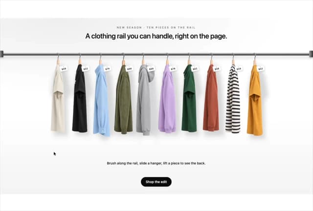

Product Rail Gallery – Fashion Store Hero Section
1.3K
Sushi Conveyor Belt Menu – Restaurant Hero Section
370
Sun Moon Dark Mode Theme Toggle
281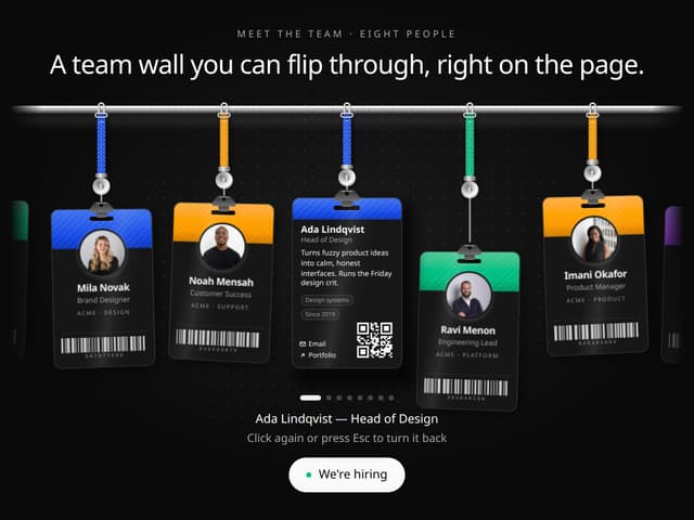
Team Lanyard Rail – Meet the Team Section with Flip Badges
223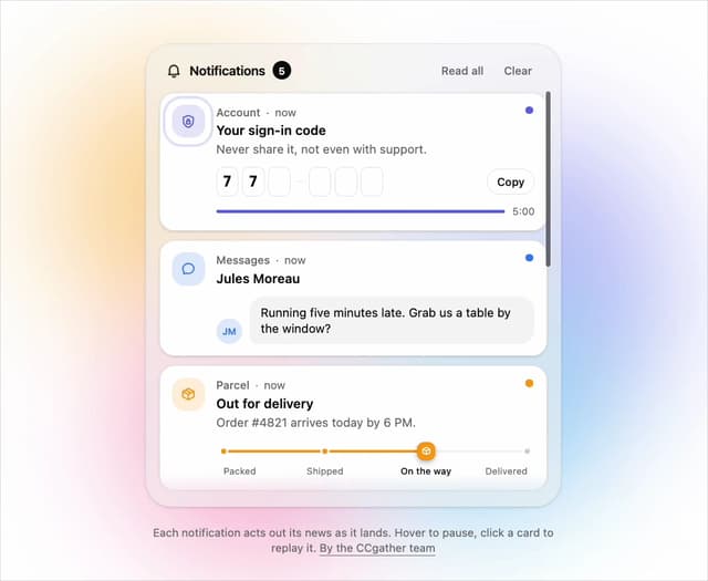
Live Notification Feed
151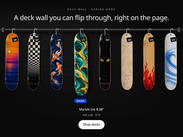
Skateboard Deck Rail Gallery – Skate Shop Hero Section
150
Country Flags Globe
134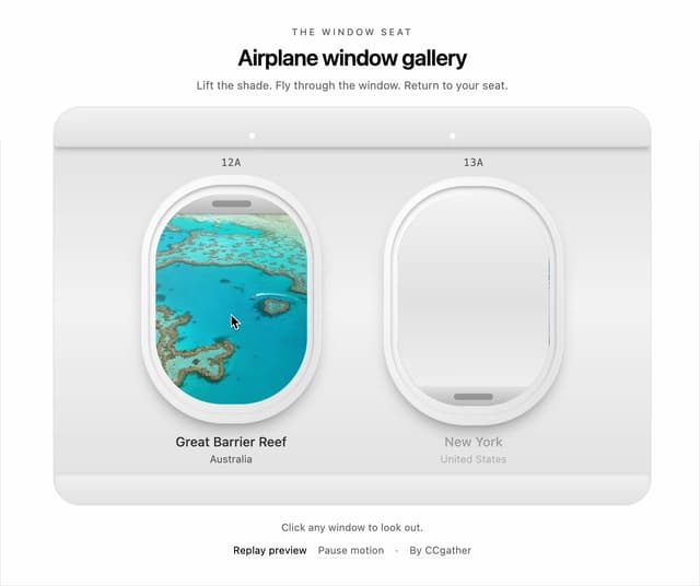
Airplane Window Gallery
124
More in Navigation
View all

Sidebar
296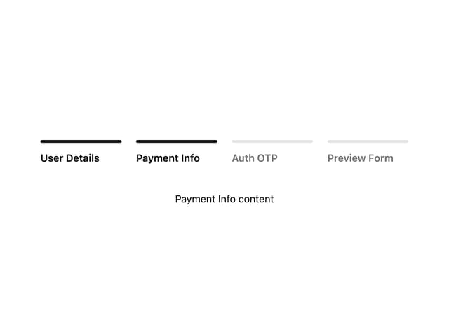

Progress Bar Stepper
45
Navbar
1
Tabs
16
Breadcrumb
103

Capsule Tabs
21
Pagination
27
Pagination with Ellipsis
18
