
About
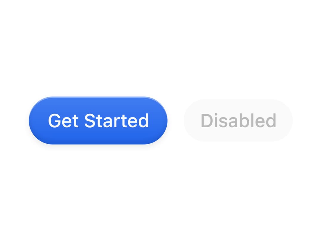
A rounded button with a glossy top-light gradient and inset sheen, built on Base UI's Button primitive with size variants.
Built with React and Tailwind. Copy the prompt and paste it into Claude Code, Cursor or Lovable: your agent adds Gloss Button to your project and fits it to your theme.
Code
How Gloss Button is used: the demo's code. The component's own source comes with a free account.
Usage.tsx
import { GlossButton } from "@/components/ui/gloss-button";

export default function GlossButtonDemo() {
  return (
    <div className="flex min-h-[200px] w-full items-center justify-center gap-3">
      <GlossButton size="lg">Get Started</GlossButton>
      <GlossButton size="default" disabled>
        Disabled
      </GlossButton>
    </div>
  );
}
Dependencies
More by Diar Muradi
View all

Toggleable Add-on Pricing
171
Toggle Pricing Cards
80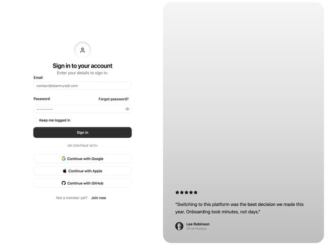
Split Sign In Form
57
ROI Pricing Calculator
52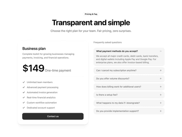
Pricing With FAQ
48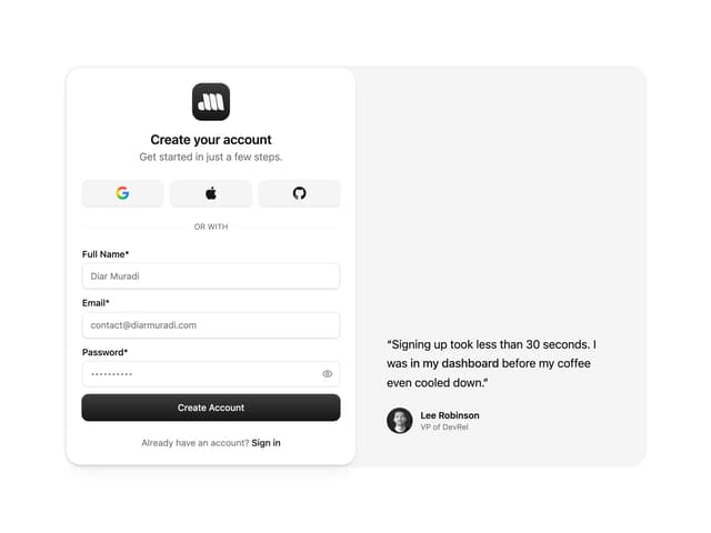
Sign Up Split Panel
43
Logo Orbit
37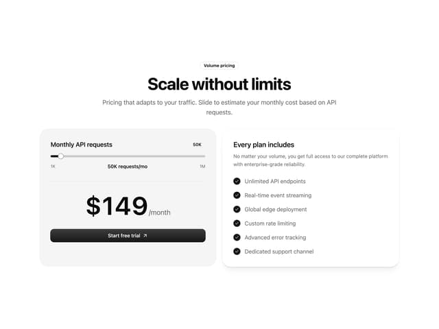
Volume Pricing Card
35
More in Buttons
View all
Texture Button
98

Button
1
Button
68

Button
65

Eclipse Button
3
Button Group
14
Base Button
4

App Store Button
459

