
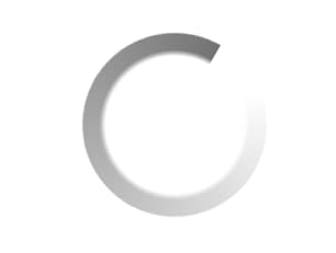
About
A tiny circular loading indicator (an indeterminate ring built from a masked conic-gradient) that takes the surrounding text color, can carry an accessible label, and supports a delay so quick loads never flash it. Ported to React from the Sina UI (ebnsina) Svelte component.
Built with React and Tailwind. Copy the prompt and paste it into Claude Code, Cursor or Lovable: your agent adds Loading Spinner to your project and fits it to your theme.
Code
How Loading Spinner is used: the demo's code. The component's own source comes with a free account.
Usage.tsx
import Spinner from "@/components/ui/spinner";

export default function SpinnerWithTextDemo() {
  return (
    <div className="flex items-center justify-center w-full h-40">
      {/* Beside its own words, it's decoration: the text says what's happening. */}
      <p role="status" className="m-0 flex items-center gap-2 text-neutral-500">
        <Spinner /> Fetching manuscripts…
      </p>
    </div>
  );
}
More by ebnsina
View all
Countdown Timer
26
Video Player
19
Alarm Clock
19
Voice Note
12
Split Button
11
Sortable List
11
Code Block
7
Stopwatch
6
More in Text
View all

Vertical Cut Reveal Characters
116

Rainbow Text Effect
47

NeonRGBTextEffect
145
Apple Hello Effect
624
Vapour Text Effect
2K

Blur Reveal
313
Aero Hero-3
580
Text Loop
324

