

About
An accessible on/off toggle built on a native checkbox with role="switch", with an iOS-style thumb that stretches toward its destination while pressed; ported to React from the Svelte original in ebnsina's Sina UI component library.
Built with React and Tailwind. Copy the prompt and paste it into Claude Code, Cursor or Lovable: your agent adds Switch to your project and fits it to your theme.
Code
How Switch is used: the demo's code. The component's own source comes with a free account.
Usage.tsx
import Switch from "@/components/ui/switch";

export default function SwitchDisabledDemo() {
  return <Switch disabled>Lend to the Córdoba library</Switch>;
}
More by ebnsina
View all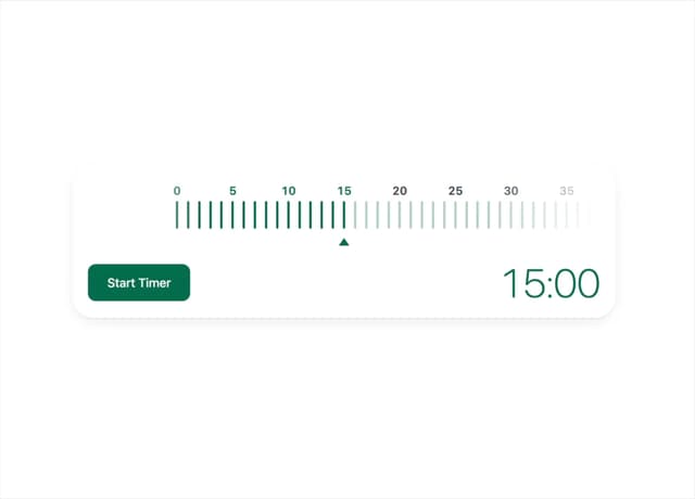
Countdown Timer
26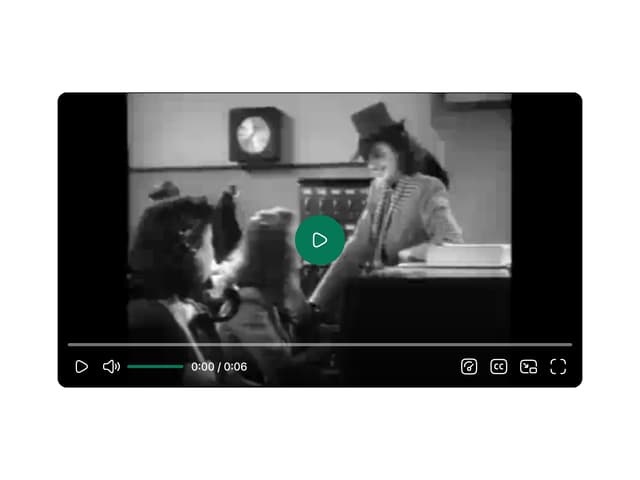
Video Player
19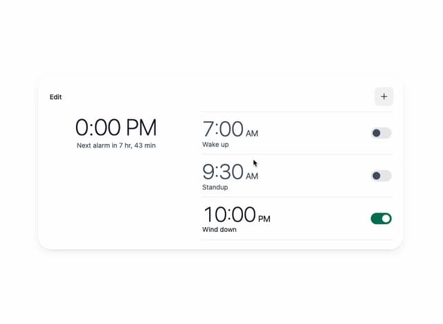
Alarm Clock
19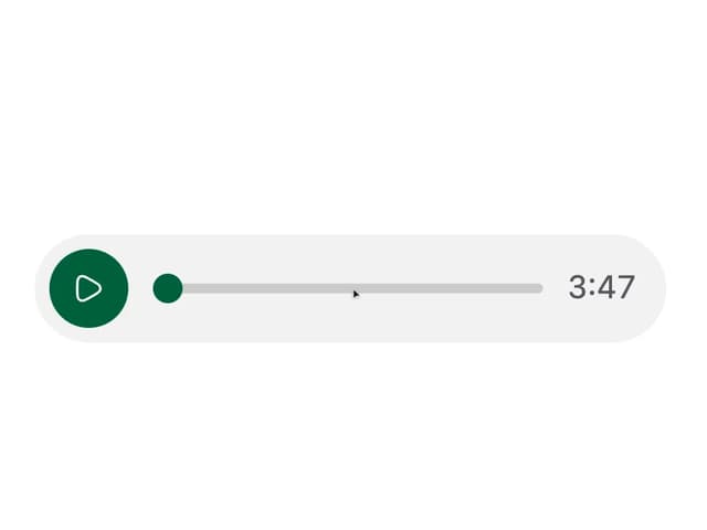
Voice Note
12
Split Button
11
Sortable List
11
Code Block
7
Stopwatch
6
More in Forms
View all

Premium Auth
525

Contact Card
1K

Login 2
8

Card Studio
41

Form
16

Book A Demo 1
74

HeroUI Field Error
10
Book A Demo 3
90