About
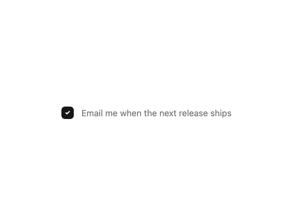
This is a checkbox component
Built with React and Tailwind. Copy the prompt and paste it into Claude Code, Cursor or Lovable: your agent adds New checkbox to your project and fits it to your theme.
Code
How New checkbox is used: the demo's code. The component's own source comes with a free account.
Usage.tsx
"use client";

import { useState } from "react";
import { Checkbox } from "@/components/ui/chekbox";

export function CheckboxPreview() {
  const [checked, setChecked] = useState(true);

  return (
    <div className="flex min-h-screen items-center justify-center">
      <Checkbox checked={checked} onChange={setChecked}>
        <span className="text-muted-foreground">
          Email me when the next release ships
        </span>
      </Checkbox>
    </div>
  );
}

export default CheckboxPreview;
Dependencies
More by Edwin Vakayil
View all
Origin Button
802
Infinite Ribbon
548
Shimmer Text
417
Dia Text
353
Icon Bar
248
FAQ Pro
230
Verified Badge
216
New Card
187
More in Forms
View all

Contact Card
1K

Premium Auth
525

Form
16

Card Studio
41

Login 2
7

Book A Demo 3
90
Book A Demo 1
74

HeroUI Field Error
10