
About
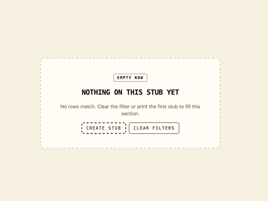
An empty-state card for lists or tables, showing a heading, helper text, and primary/secondary action buttons for when no rows match a filter.
Built with React and Tailwind. Copy the prompt and paste it into Claude Code, Cursor or Lovable: your agent adds Empty State Card to your project and fits it to your theme.
Code
How Empty State Card is used: the demo's code. The component's own source comes with a free account.
Usage.tsx
import PageEmpty from "@/components/ui/page-empty";

export default function PageEmptyDemo() {
  return (
    <div className="flex min-h-screen w-full items-center justify-center bg-background p-10 text-foreground">
      <PageEmpty />
    </div>
  );
}
More by f0rextasy
View all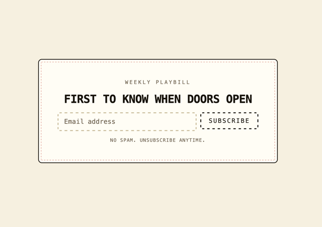
Newsletter Signup Card
11
Stamp Seal
10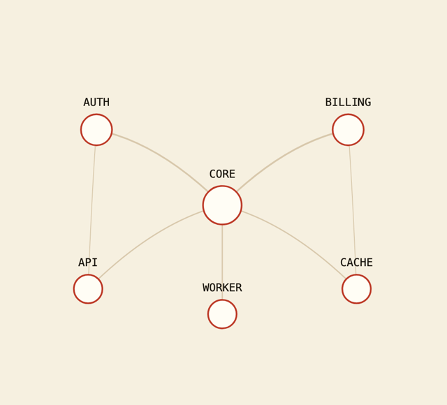
Network Graph
9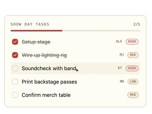
Board Checklist
5
Checkbox
4
Payment Methods
4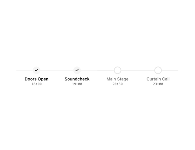
Milestone Chart
4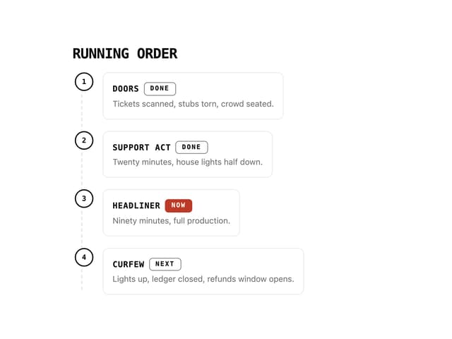
Running Order Timeline
3
More in Cards
View all

Course Design Cards
1.1K

Interactive Tech Stack Bento Grid with Hover Effects
225
Stats cards with links
84

Statistics Card 7
301

Card Studio
10
Statistics Card 2
276

Weather Card
59
Card
56
