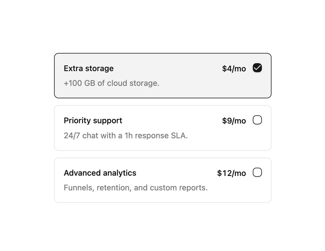
About
Bordered add-on selection cards with a checkbox, title, description and price that highlight when checked.
Built with React and Tailwind. Copy the prompt and paste it into Claude Code, Cursor or Lovable: your agent adds Choice Cards to your project and fits it to your theme.
Code
How Choice Cards is used: the demo's code. The component's own source comes with a free account.
Usage.tsx
import { Checkbox08 } from "@/components/ui/checkbox-08";

export default function Default() {
  return (
    <div className="flex min-h-svh w-full items-center justify-center p-6">
      <Checkbox08 />
    </div>
  );
}
More by felipemenezes098
View all
Centered Hero with Image Fan
978
Editorial Collage Hero
460
Split Hero With Image Cards
417
Editorial Image Hero
394
Scroll 01
368
Real Estate Search Hero
198
Editorial Hero
180
Hero with Dashboard Mockup
128
More in Pricing
View all
Pricing Section
610

Pricing Card
542

Pricing Section
183

RuixenPricing05
103
Single Pricing Card
799
Pricing Card With Features
176

Pricing Cards
17
Glowing Pricing Tiers
65


