
About
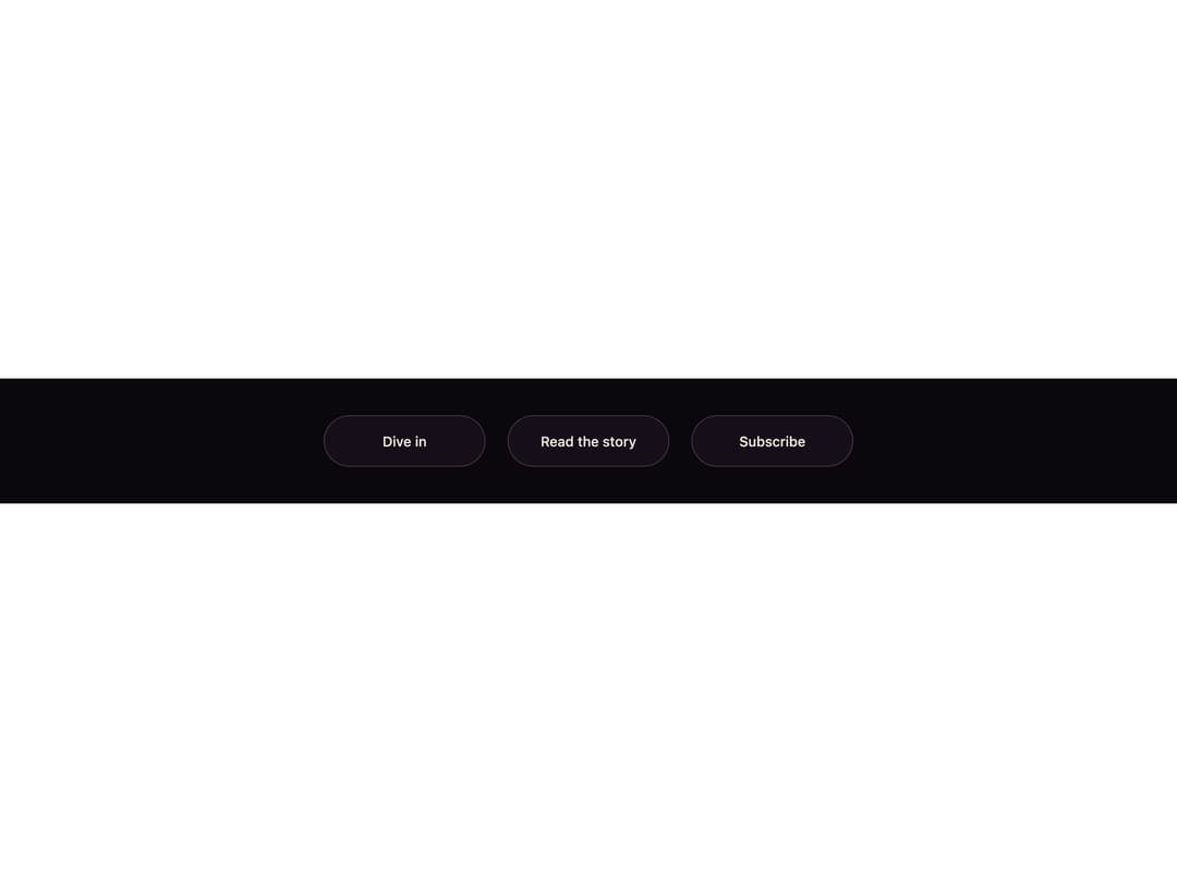
A pill button whose label is duplicated in two colors; on hover a liquid wave rises from the bottom edge, revealing the ink-colored copy exactly where it reaches.
Built with React and Tailwind. Copy the prompt and paste it into Claude Code, Cursor or Lovable: your agent adds Tidefill Button to your project and fits it to your theme.
Code
How Tidefill Button is used: the demo's code. The component's own source comes with a free account.
Usage.tsx
"use client";

import { TidefillButton } from "@/components/ui/tidefill-button";

export default function Demo() {
  return (
    <div className="flex min-h-full w-full flex-wrap items-center justify-center gap-6 bg-[#0b080d] p-10">
      <TidefillButton>Dive in</TidefillButton>
      <TidefillButton tone="lilac">Read the story</TidefillButton>
      <TidefillButton tone="cream">Subscribe</TidefillButton>
    </div>
  );
}
More by ham7a311
View all
Wave Mesh
83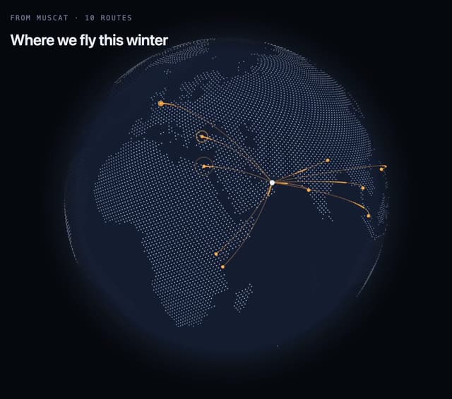
Route Globe
79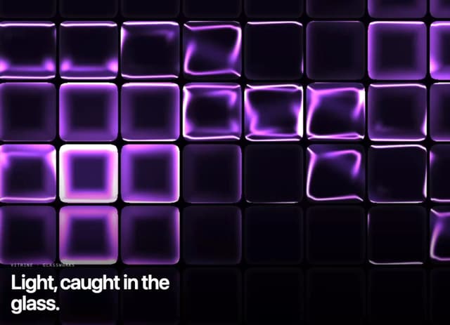
Glass Tiles
68
Glyph Swell
28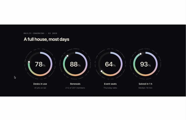
Orbit Ring Stats
26
Ask Bar
25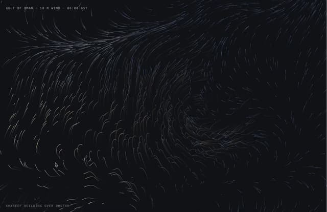
Wind Map
18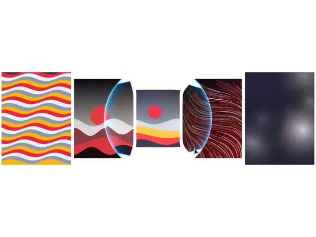
Glass Carousel
18
More in Buttons
View all
Texture Button
98

Button
1
Button
68

Eclipse Button
3

Button
65
Base Button
4

HeroUI Button Group
2

App Store Button
460

