
About
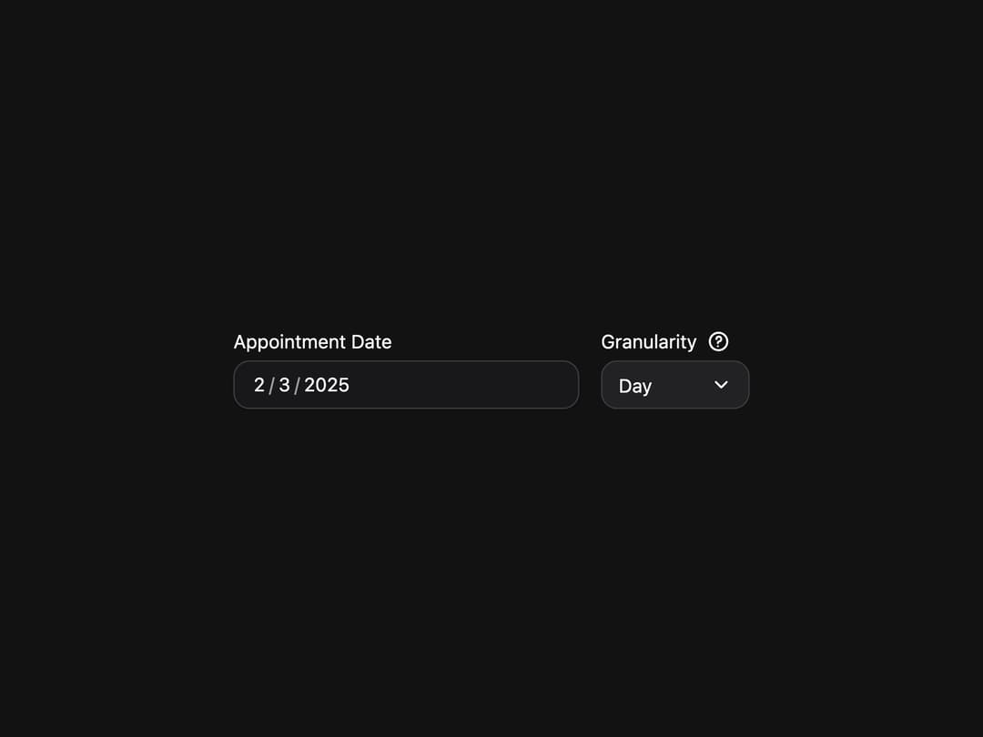
Date input field with labels, descriptions, and validation built on React Aria DateField.
Built with React and Tailwind. Copy the prompt and paste it into Claude Code, Cursor or Lovable: your agent adds DateField to your project and fits it to your theme.
Code
How DateField is used: the demo's code. The component's own source comes with a free account.
Usage.tsx
"use client";

import * as React from "react";
import {
  CircleQuestionIcon,
  DateField,
  Label,
  ListBox,
  Select,
  Tooltip,
  parseDate,
  parseZonedDateTime,
  type DateValue,
} from "@/components/ui/heroui-date-field";

export default function Granularity() {
  const granularityOptions = [
    { id: "day", label: "Day" },
    { id: "hour", label: "Hour" },
    { id: "minute", label: "Minute" },
    { id: "second", label: "Second" },
  ] as const;

  const [granularity, setGranularity] = React.useState<"day" | "hour" | "minute" | "second">("day");

  let defaultValue: DateValue;
  if (granularity === "day") {
    defaultValue = parseDate("2025-02-03");
  } else {
    defaultValue = parseZonedDateTime("2025-02-03T08:45:00[America/Los_Angeles]");
  }

  return (
    <div className="flex min-h-screen w-full items-center justify-center overflow-hidden bg-background p-8">
      <div className="flex gap-4">
        <DateField
          className="w-[256px]"
          defaultValue={defaultValue}
          granularity={granularity}
          name="granularity-date"
        >
          <Label>Appointment Date</Label>
          <DateField.Group>
            <DateField.Input />
          </DateField.Group>
        </DateField>
        <div className="flex flex-col gap-1">
          <div className="flex items-center gap-2">
            <Label>Granularity</Label>
            <Tooltip delay={0}>
              <Tooltip.Trigger aria-label="Granularity information">
                <CircleQuestionIcon className="size-4 text-muted" />
              </Tooltip.Trigger>
              <Tooltip.Content placement="bottom start">
                <p>
                  Determines the smallest unit displayed in the date picker. By default, this is "day"
                  for dates, and "minute" for times.
                </p>
              </Tooltip.Content>
            </Tooltip>
          </div>
          <Select
            className="w-[110px]"
            placeholder="Select granularity"
            value={granularity}
            variant="secondary"
            onChange={(value) => setGranularity(value as typeof granularity)}
          >
            <Select.Trigger>
              <Select.Value />
              <Select.Indicator />
            </Select.Trigger>
            <Select.Popover>
              <ListBox>
                {granularityOptions.map((option) => (
                  <ListBox.Item key={option.id} id={option.id} textValue={option.label}>
                    {option.label}
                    <ListBox.ItemIndicator />
                  </ListBox.Item>
                ))}
              </ListBox>
            </Select.Popover>
          </Select>
        </div>
      </div>
    </div>
  );
}

export { Granularity };
More by Hero Ui
View all

DatePicker
468
Chip
442
The Pagination
362
HeroUI Table
109
HeroUI Color Picker
107
Skeleton
105
HeroUI Disclosure Group
95
HeroUI AlertDialog
81
More in Forms
View all

Premium Auth
525

Contact Card
1K

Login 2
8

Form
16

Card Studio
41
HeroUI Field Error
10

Book A Demo 1
74
Book A Demo 3
90