
About
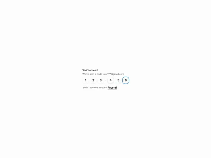
HeroUI v3 InputOTP — segmented one-time-password input: digit counts, patterns, disabled, controlled, validation, on-complete, form integration, variants and on-surface.
Built with React and Tailwind. Copy the prompt and paste it into Claude Code, Cursor or Lovable: your agent adds HeroUI Input OTP to your project and fits it to your theme.
Code
How HeroUI Input OTP is used: the demo's code. The component's own source comes with a free account.
Usage.tsx
import { InputOTP } from "@/components/ui/heroui-input-otp"
import { Label, Link } from "@heroui/react"
export default function Basic() {
return (
<div className="flex w-[280px] flex-col gap-2">
<div className="flex flex-col gap-1">
<Label>Verify account</Label>
<p className="text-sm text-muted-foreground">We've sent a code to a****@gmail.com</p>
</div>
<InputOTP maxLength={6}>
<InputOTP.Group>
<InputOTP.Slot index={0} />
<InputOTP.Slot index={1} />
<InputOTP.Slot index={2} />
</InputOTP.Group>
<InputOTP.Separator />
<InputOTP.Group>
<InputOTP.Slot index={3} />
<InputOTP.Slot index={4} />
<InputOTP.Slot index={5} />
</InputOTP.Group>
</InputOTP>
<div className="flex items-center gap-[5px] px-1 pt-1">
<p className="text-sm text-muted-foreground">Didn't receive a code?</p>
<Link className="text-foreground underline" href="#">
Resend
</Link>
</div>
</div>
)
}