
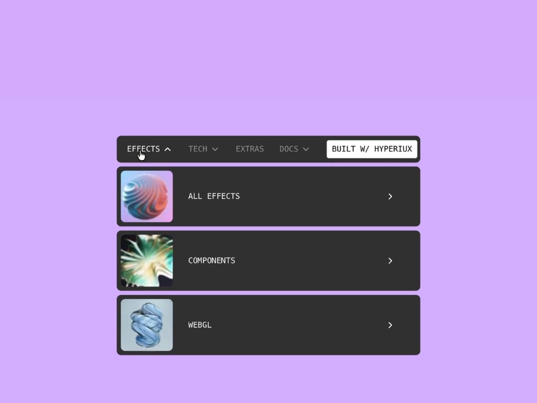
About
Glass-morphism pill navigation with animated dropdown panels, GSAP text-swap hover on every link, a CTA color invert, and a collapsible mobile accordion. Pointer-type aware, respects reduced motion.
Built with React and Tailwind. Copy the prompt and paste it into Claude Code, Cursor or Lovable: your agent adds Elevate Navbar to your project and fits it to your theme.
Code
How Elevate Navbar is used: the demo's code. The component's own source comes with a free account.
Usage.tsx
"use client";

import ElevateNavbar from "@/components/ui/elevate-navbar";

export default function ElevateNavbarDemo() {
  return <ElevateNavbar />;
}
Dependencies
More by Hyperiux Vault
View all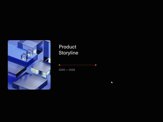

Product Timeline
2.4K
Stack Spread
1.3K
Arrow Fill Button
940
Interactive List Preview
880
Shiny Button
814
Circular Split Roll
686
Zoom Slider
460
Stack Loader
379
More in Forms
View all

Contact Card
1K

Premium Auth
525

Form
16

Card Studio
41

Login 2
7

Book A Demo 3
90
Book A Demo 1
74

HeroUI Field Error
10