
About
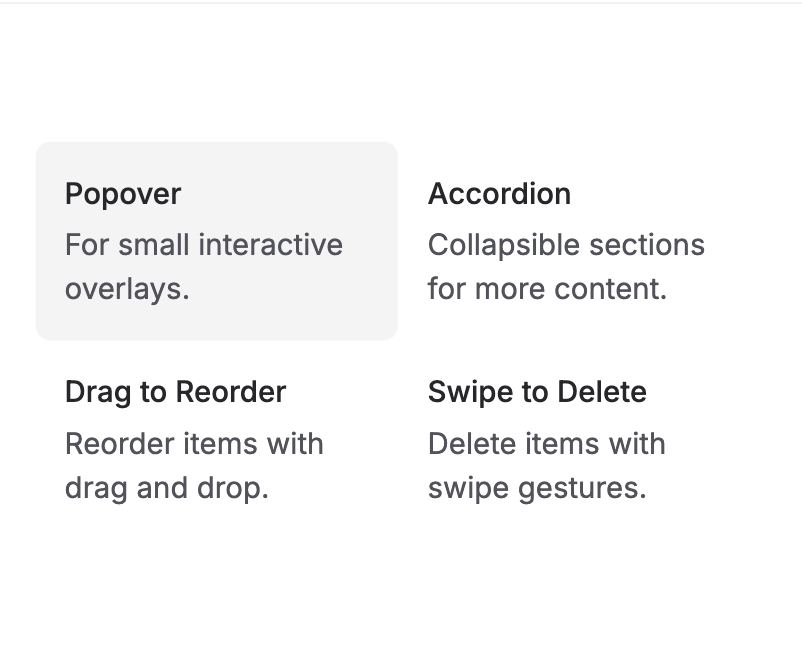
The AnimatedBackground component visually highlights selected items by sliding a background into view when hovered over or clicked. This smooth transition helps users focus on the active item, making it ideal for interactive lists, menus, or navigations where clear selection feedback is important.
Built with React and Tailwind. Copy the prompt and paste it into Claude Code, Cursor or Lovable: your agent adds Animated Background to your project and fits it to your theme.
Code
How Animated Background is used: the demo's code. The component's own source comes with a free account.
Usage.tsx
import AnimatedBackground from '@/components/ui/animated-background';

export function AnimatedCardBackgroundHover() {
  const ITEMS = [
    {
      id: 1,
      title: 'Dialog',
      description: 'Enhances modal presentations.',
    },
    {
      id: 2,
      title: 'Popover',
      description: 'For small interactive overlays.',
    },
    {
      id: 3,
      title: 'Accordion',
      description: 'Collapsible sections for more content.',
    },
    {
      id: 4,
      title: 'Collapsible',
      description: 'Collapsible sections for more content.',
    },
    {
      id: 5,
      title: 'Drag to Reorder',
      description: 'Reorder items with drag and drop.',
    },
    {
      id: 6,
      title: 'Swipe to Delete',
      description: 'Delete items with swipe gestures.',
    },
  ];

  return (
    <div className='grid grid-cols-2 p-10 md:grid-cols-3'>
      <AnimatedBackground
        className='rounded-lg bg-zinc-100 dark:bg-zinc-800'
        transition={{
          type: 'spring',
          bounce: 0.2,
          duration: 0.6,
        }}
        enableHover
      >
        {ITEMS.map((item, index) => (
          <div key={index} data-id={`card-${index}`}>
            <div className='flex select-none flex-col space-y-1 p-4'>
              <h3 className='text-base font-medium text-zinc-800 dark:text-zinc-50'>
                {item.title}
              </h3>
              <p className='text-base text-zinc-600 dark:text-zinc-400'>
                {item.description}
              </p>
            </div>
          </div>
        ))}
      </AnimatedBackground>
    </div>
  );
}
Dependencies
More by Julien Thibeaut
View all

Dock
3.1K
Text Effect
1.6K
Infinite Slider
1.5K
Text Shimmer
1.3K
Text Scramble
1.1K
Progressive blur
688
Glow Effect
615
Tailwind CSS Background Snippet
558
More in Cards
View all

Course Design Cards
1.1K

Interactive Tech Stack Bento Grid with Hover Effects
223
Stats cards with links
84

Statistics Card 7
301

Card Studio
10
Statistics Card 2
276

Weather Card
59
Card
56
