
About
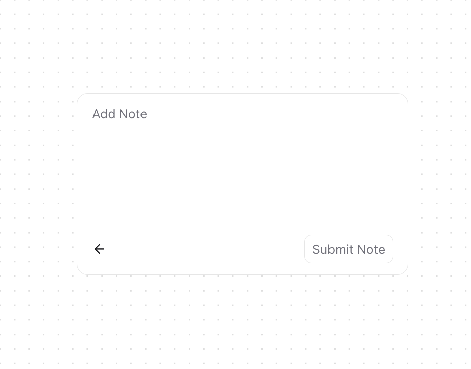
A simple popover for quick user interactions over existing content. It pops up on command, and closes easily with a click outside or on a close button.
Built with React and Tailwind. Copy the prompt and paste it into Claude Code, Cursor or Lovable: your agent adds Popover to your project and fits it to your theme.
Code
How Popover is used: the demo's code. The component's own source comes with a free account.
Usage.tsx
import { Popover } from "@/components/ui/popover"

function PopoverDemo() {
  return (
    <div className="block">
      <Popover />
    </div>
  );
}

export { PopoverDemo };
Dependencies
More by Julien Thibeaut
View all

Dock
3.1K
Text Effect
1.6K
Infinite Slider
1.5K
Text Shimmer
1.3K
Text Scramble
1.1K
Progressive blur
688
Glow Effect
615
Tailwind CSS Background Snippet
558
More in Buttons
View all
Texture Button
98

Button
1
Button
68

Eclipse Button
3

Button
65

App Store Button
459

HeroUI Button Group
2
Base Button
4

