About
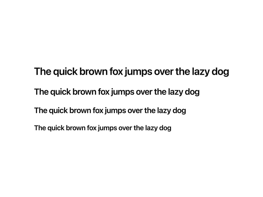
A typographic heading component that renders semantic h1–h4 elements with hierarchical font sizing for section titles.
Built with React and Tailwind. Copy the prompt and paste it into Claude Code, Cursor or Lovable: your agent adds Heading to your project and fits it to your theme.
Code
How Heading is used: the demo's code. The component's own source comes with a free account.
Usage.tsx
import { Heading } from "@/components/ui/heading";

export default function HeadingDemo() {
  return (
    <div className="flex flex-col gap-y-4 p-6">
      <Heading level={1}>The quick brown fox jumps over the lazy dog</Heading>
      <Heading level={2}>The quick brown fox jumps over the lazy dog</Heading>
      <Heading level={3}>The quick brown fox jumps over the lazy dog</Heading>
      <Heading level={4}>The quick brown fox jumps over the lazy dog</Heading>
    </div>
  );
}
Dependencies
More by Intent UI
View all

Radar Chart
224
Radial Chart
81
Bar Chart
45
Pie Chart
34
Toggle Group
27
Loader
25
Progress Bar
19
Color Slider
14
More in Text
View all

Vertical Cut Reveal Characters
116

Rainbow Text Effect
47

NeonRGBTextEffect
145
Apple Hello Effect
624
Vapour Text Effect
2K

Blur Reveal
313
Aero Hero-3
580
Text Loop
324

