About
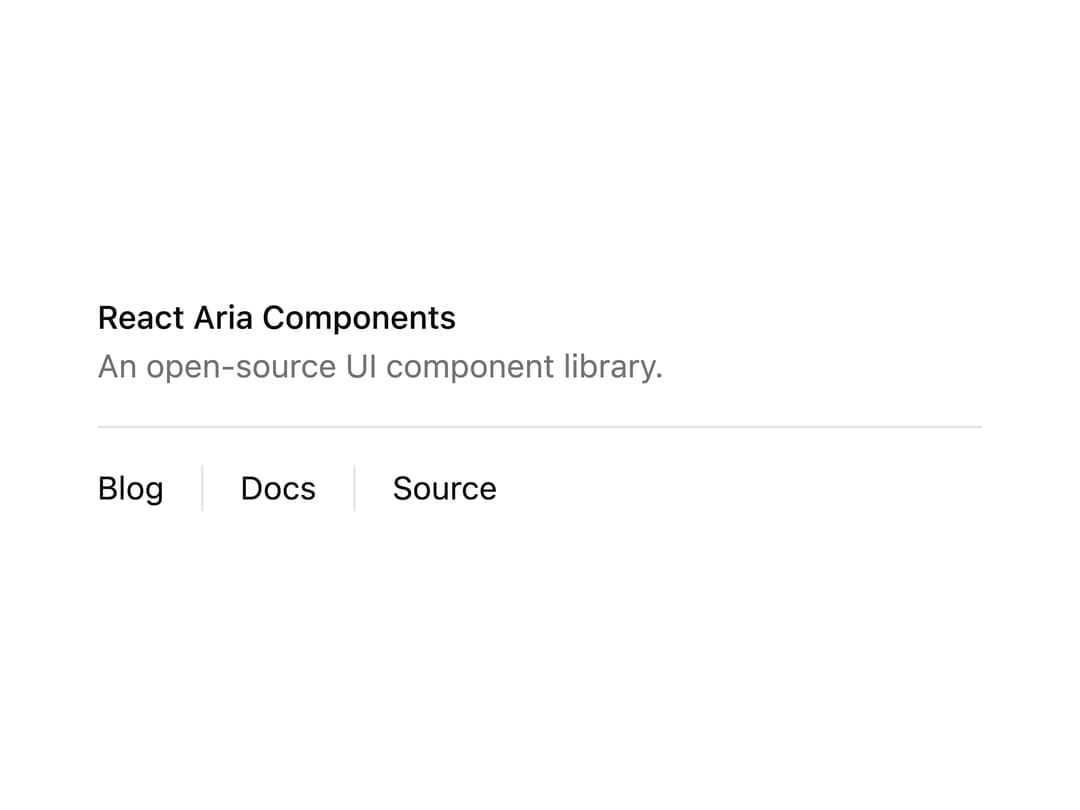
A thin horizontal or vertical divider line to separate content sections, built on React Aria.
Built with React and Tailwind. Copy the prompt and paste it into Claude Code, Cursor or Lovable: your agent adds Separator to your project and fits it to your theme.
Code
How Separator is used: the demo's code. The component's own source comes with a free account.
Usage.tsx
import { Separator } from "@/components/ui/separator";

export default function SeparatorDemo() {
  return (
    <div className="w-full max-w-sm">
      <div className="space-y-1">
        <h4 className="text-sm font-medium leading-none">
          React Aria Components
        </h4>
        <p className="text-sm text-muted-foreground">
          An open-source UI component library.
        </p>
      </div>
      <Separator className="my-4" />
      <div className="flex h-5 items-center space-x-4 text-sm">
        <div>Blog</div>
        <Separator orientation="vertical" />
        <div>Docs</div>
        <Separator orientation="vertical" />
        <div>Source</div>
      </div>
    </div>
  );
}
Dependencies
More by Intent UI
View all

Radar Chart
224
Radial Chart
81
Bar Chart
45
Pie Chart
34
Toggle Group
27
Loader
25
Progress Bar
19
Color Slider
14