
About
Polymorphic button with brand-red color palette. Variants: default (red), outline, ghost, link. Sizes: sm/md/lg/icon. Forwards all native button props and supports asChild via Radix Slot for use as Link or Next Link wrapper.
Built with React and Tailwind. Copy the prompt and paste it into Claude Code, Cursor or Lovable: your agent adds Button to your project and fits it to your theme.
Code
How Button is used: the demo's code. The component's own source comes with a free account.
Usage.tsx
import Button from '@/components/ui/button'

export default function Demo() {
  return (
    <div className="flex flex-wrap items-center gap-4 p-8 bg-slate-50">
      <Button>Gratis offerte aanvragen</Button>
      <Button variant="outline" size="sm">
        Bel direct
      </Button>
      <Button variant="ghost">Meer info</Button>
      <Button variant="link">Bekijk diensten</Button>
      <Button size="lg" className="rounded-full">
        Plan een afspraak
      </Button>
    </div>
  )
}
Dependencies
More by Jason Mohab-Ali
View all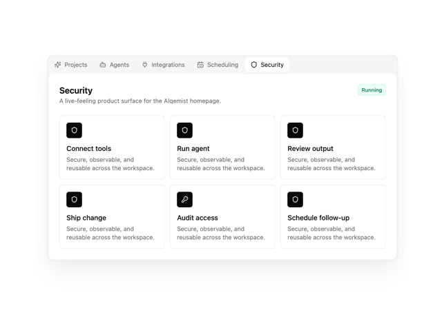

Alqemist Interactive Demo
12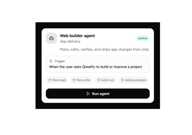
Qreatify Super Agent Card
5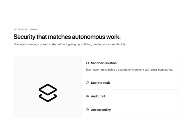
Alqemist Security
4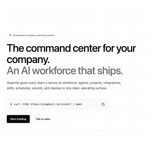
Alqemist Hero
4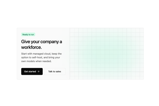
Alqemist Cta
3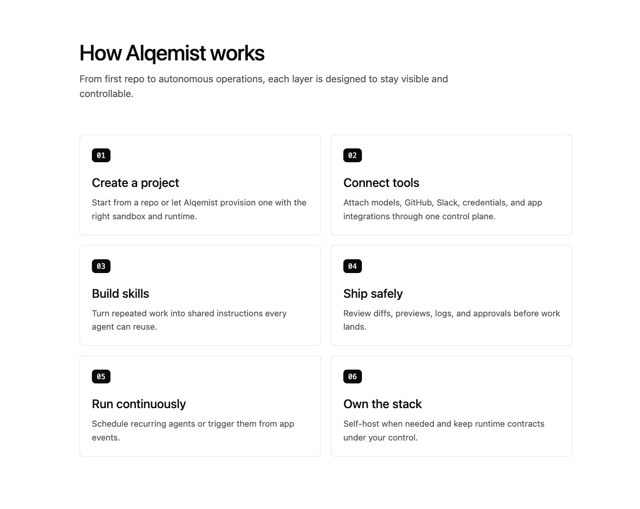
Alqemist How It Works
3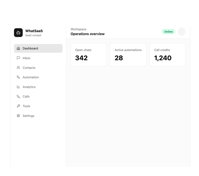
What Saa SApp Shell
2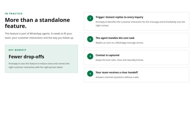
FirstReply Product Detail flow
More in Buttons
View all
Texture Button
98

Button
18

Eclipse Button
39

App Store Button
461

Button
9

Button Group
6
Button
4
Native Button
12


