
About
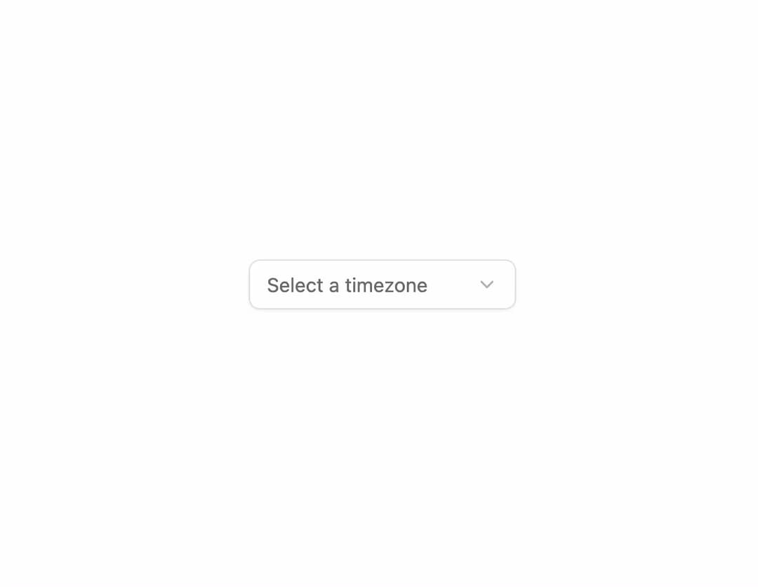
Select dropdown built on Radix UI with support for groups, labels, and separators.
Built with React and Tailwind. Copy the prompt and paste it into Claude Code, Cursor or Lovable: your agent adds Select to your project and fits it to your theme.
Code
How Select is used: the demo's code. The component's own source comes with a free account.
Usage.tsx
"use client"

import {
  Select,
  SelectContent,
  SelectItem,
  SelectTrigger,
  SelectValue,
} from "@/components/ui/interfaces-select"

export default function SelectDemo() {
  return (
    <div className="flex w-full min-h-screen items-center justify-center bg-background p-8 overflow-hidden">
      <Select>
        <SelectTrigger className="w-48">
          <SelectValue placeholder="Select a timezone" />
        </SelectTrigger>
        <SelectContent>
          <SelectItem value="utc">UTC</SelectItem>
          <SelectItem value="est">Eastern (EST)</SelectItem>
          <SelectItem value="cst">Central (CST)</SelectItem>
          <SelectItem value="mst">Mountain (MST)</SelectItem>
          <SelectItem value="pst">Pacific (PST)</SelectItem>
        </SelectContent>
      </Select>
    </div>
  )
}
Dependencies
More by jshguo
View all

Progress
427
Textarea
260
Input OTP
161
Interfaces Carousel
161
Switch
138
Hover Card
110
Card
85
Interfaces Breadcrumb
63
More in Forms
View all

Contact Card
1K

Premium Auth
525

Form
16

Card Studio
41

Login 2
7

Book A Demo 3
90
Book A Demo 1
74

HeroUI Field Error
10