
About
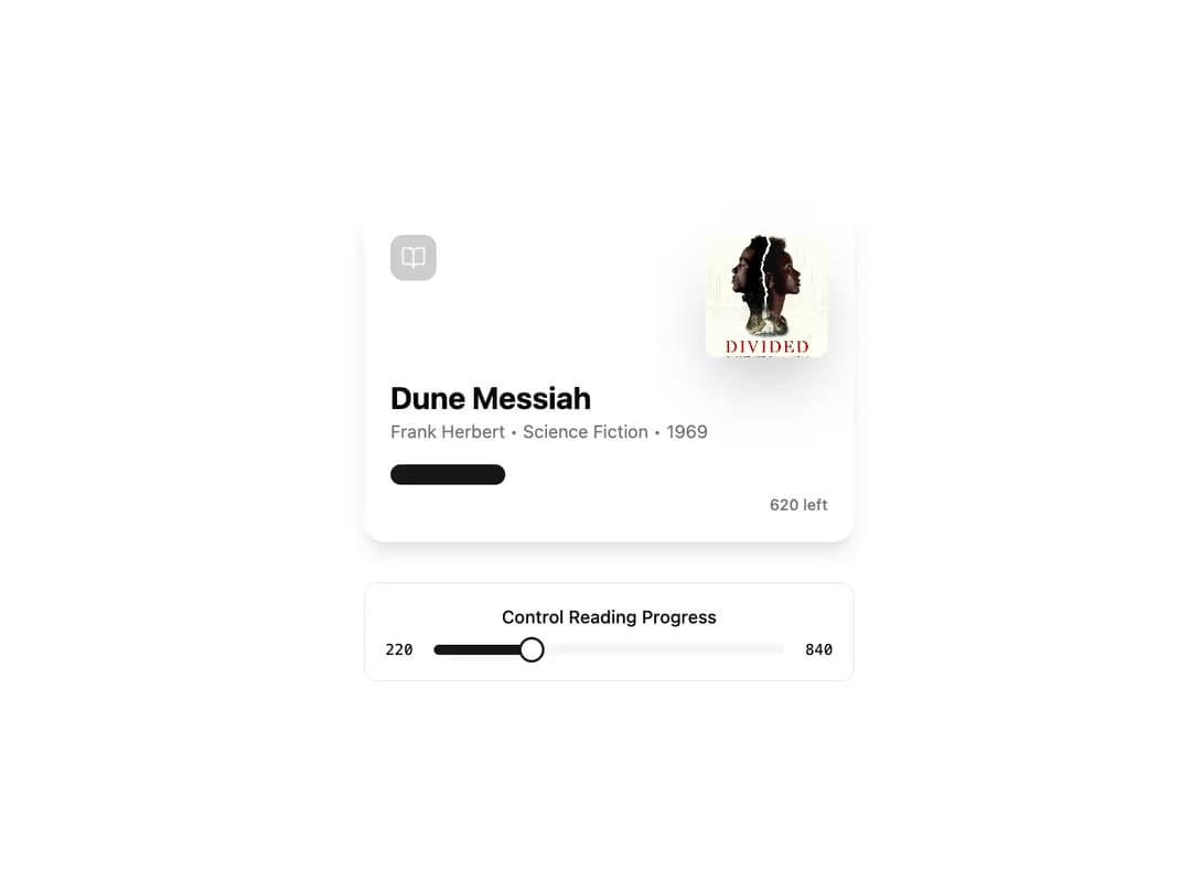
AudiobookCard An AudiobookCard is a visually rich component designed to display the progress and details of an audiobook or any reading material. It features a prominent cover image, title, author details, and an animated, segmented progress bar. The component is built to be highly reusable and customizable through props.
Built with React and Tailwind. Copy the prompt and paste it into Claude Code, Cursor or Lovable: your agent adds Audiobook Card to your project and fits it to your theme.
Code
How Audiobook Card is used: the demo's code. The component's own source comes with a free account.
Usage.tsx
import * as React from "react";
import { BookOpen } from "lucide-react";
import { AudiobookCard } from "@/components/ui/audiobook-card"; // Adjust path as needed
import { Slider } from "@/components/ui/slider"; // Assuming you have a shadcn Slider component
import { Label } from "@/components/ui/label"; // Assuming you have a shadcn Label component

export default function AudiobookCardDemo() {
  const totalPages = 840;
  const [pagesRead, setPagesRead] = React.useState(220);

  return (
    <div className="flex min-h-screen w-full flex-col items-center justify-center gap-8 bg-background p-4">
      {/* The component itself */}
      <AudiobookCard
        imageUrl="https://cdn.21st.dev/assets/mirror/b7/b77e30ce003f7df40567dcef0d7461ce8f6a245374a21ba750b271be5e844198.jpg" // Using the actual Dune Messiah cover
        title="Dune Messiah"
        author="Frank Herbert"
        category="Science Fiction"
        year={1969}
        totalPages={totalPages}
        pagesRead={pagesRead}
        icon={<BookOpen className="h-5 w-5" />}
      />

      {/* Controls to demonstrate interactivity */}
      <div className="w-full max-w-sm rounded-lg border bg-card p-4">
        <Label htmlFor="progress-slider" className="mb-2 block text-center text-sm font-medium">
          Control Reading Progress
        </Label>
        <div className="flex items-center gap-4">
          <span className="text-xs font-mono">{pagesRead}</span>
          <Slider
            id="progress-slider"
            min={0}
            max={totalPages}
            step={10}
            value={[pagesRead]}
            onValueChange={(value) => setPagesRead(value[0])}
            aria-label="Adjust pages read"
          />
           <span className="text-xs font-mono">{totalPages}</span>
        </div>
      </div>
    </div>
  );
}
Dependencies
More by Kavi Katiyar
View all

3D Card
1K
Bento Product Features
842
Testimonial Slider
723
Card
614
Order Confirmation Card
512
Project Detail View
415
Animated Card
402
Performance Benchmark Card
395
More in Cards
View all

Course Design Cards
1.1K

Interactive Tech Stack Bento Grid with Hover Effects
223
Stats cards with links
84

Statistics Card 7
301

Card Studio
10
Statistics Card 2
276

Weather Card
59
Card
56
