
About
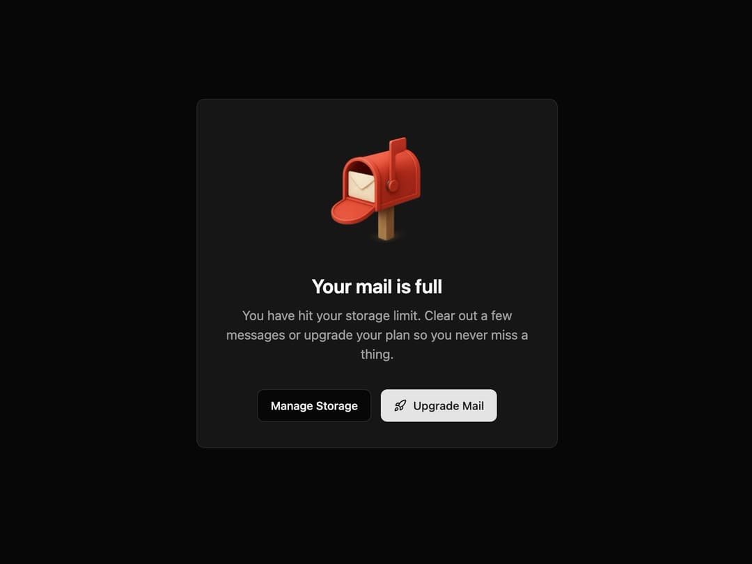
Full Mailbox State This component informs the user that they have reached a limit, prompting them with primary and secondary actions. It is animated to draw attention and improve user experience.
Built with React and Tailwind. Copy the prompt and paste it into Claude Code, Cursor or Lovable: your agent adds State to your project and fits it to your theme.
Code
How State is used: the demo's code. The component's own source comes with a free account.
Usage.tsx
import { MailboxFullState } from "@/components/ui/state"; // Adjust the import path
import { Rocket } from "lucide-react";

/**
 * Demo component to showcase the MailboxFullState.
 */
export default function MailboxFullStateDemo() {
  return (
    <div className="flex h-screen w-full items-center justify-center bg-background p-4">
      <MailboxFullState
        imageUrl="https://www.thiings.co/_next/image?url=https%3A%2F%2Flftz25oez4aqbxpq.public.blob.vercel-storage.com%2Fimage-WYuC7gUQSKvGrmWIMI6NB1Ec64dbEv.png&w=1000&q=75"
        title="Your mail is full"
        description="You have hit your storage limit. Clear out a few messages or upgrade your plan so you never miss a thing."
        secondaryAction={{
          text: "Manage Storage",
          onClick: () => console.log("Manage Storage clicked"),
        }}
        primaryAction={{
          text: "Upgrade Mail",
          onClick: () => console.log("Upgrade Mail clicked"),
          icon: <Rocket className="h-4 w-4" />,
        }}
      />
    </div>
  );
}
Dependencies
More by Kavi Katiyar
View all

3D Card
1K
Bento Product Features
844
Testimonial Slider
724
Card
615
Order Confirmation Card
513
Project Detail View
415
Animated Card
402
Performance Benchmark Card
395
More in Buttons
View all
Texture Button
98

Button
1
Button
68

Button
65

Eclipse Button
3
Base Button
4

HeroUI Button Group
2

App Store Button
460

