
About
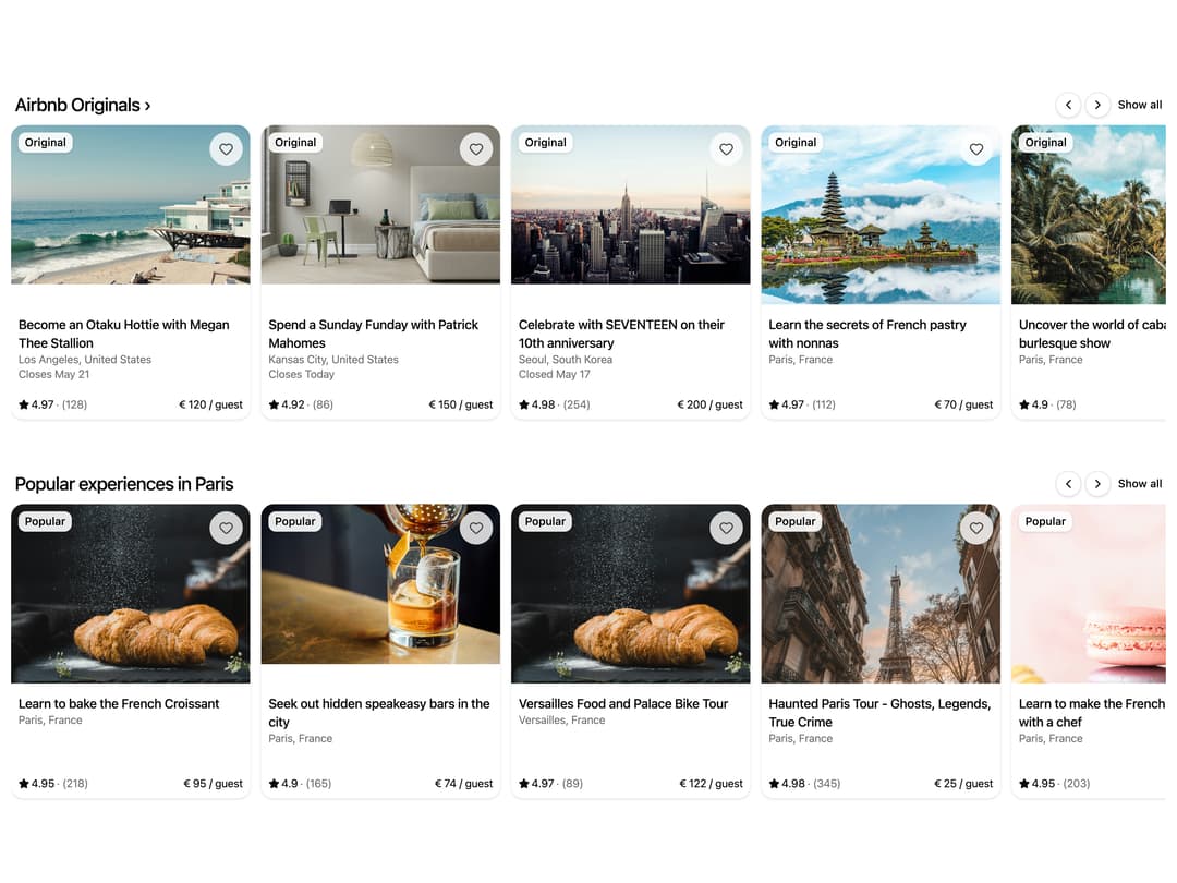
A horizontally scrollable carousel of experience cards with image, rating, price, and favorite button, ideal for showcasing listings or products.
Built with React and Tailwind. Copy the prompt and paste it into Claude Code, Cursor or Lovable: your agent adds Carousel Cards to your project and fits it to your theme.
Code
How Carousel Cards is used: the demo's code. The component's own source comes with a free account.
Usage.tsx
import CarouselCards from "@/components/ui/carousel-cards";

export default function Default() {
  return <CarouselCards />;
}
Dependencies
More by Kokonut UI
View all

Background Paths
5.8K
Shape Landing Hero
3.6K
Beams Background
2.8K
Bento Grid
2.2K
v0 AI Chat
2.1K
AI Voice Input
1.7K
Hand Writing Text
1.3K
Action Search Bar
1.3K
More in Cards
View all

Course Design Cards
1.1K

Interactive Tech Stack Bento Grid with Hover Effects
221
Stats cards with links
84

Statistics Card 7
301

Card Studio
10
Statistics Card 2
276

Weather Card
59
Card
56
