
About
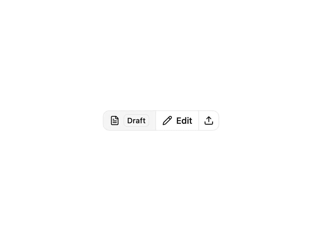
ReUI Button Group with the first 10 official ReUI examples, preserved from the MIT-licensed source registry.
Built with React and Tailwind. Copy the prompt and paste it into Claude Code, Cursor or Lovable: your agent adds ReUI Button Group to your project and fits it to your theme.
Code
How ReUI Button Group is used: the demo's code. The component's own source comes with a free account.
Usage.tsx
import { FileTextIcon, PencilIcon, UploadIcon } from "lucide-react"
import { Badge } from "@/components/ui/reui-button-group-utils/badge"

import { Button } from "@/components/ui/reui-button-group-utils/button"
import { ButtonGroup } from "@/components/ui/reui-button-group"

export default function Pattern() {
  return (
    <ButtonGroup>
      <Button variant="outline">
        <FileTextIcon aria-hidden="true" />
        <Badge variant="warning-light">Draft</Badge>
      </Button>

      <Button variant="outline">
        <PencilIcon aria-hidden="true" />
        <span>Edit</span>
      </Button>

      <Button variant="outline" size="icon">
        <UploadIcon aria-hidden="true" />
      </Button>
    </ButtonGroup>
  )
}