
About
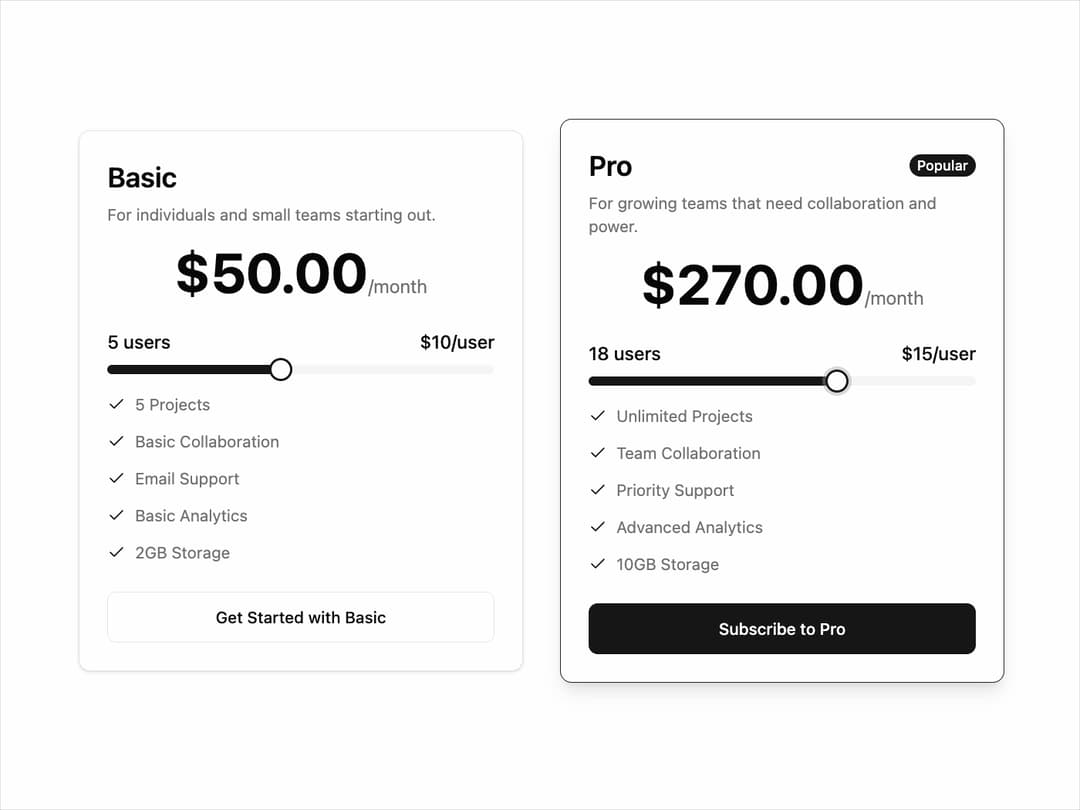
Pricing Plan Selection UI that helps users compare subscription tiers. It presents two options — Basic for individuals and small teams with limited features, and Pro for growing teams with advanced tools. Each plan shows price, features, and a user slider that adjusts cost per user, making pricing transparent. The design highlights the Pro plan with a “Popular” tag and a bold CTA button, guiding users toward the upgrade. It’s ideal for SaaS apps offering tiered subscriptions.
Built with React and Tailwind. Copy the prompt and paste it into Claude Code, Cursor or Lovable: your agent adds Pricing to your project and fits it to your theme.
Code
How Pricing is used: the demo's code. The component's own source comes with a free account.
Usage.tsx
import { InteractivePricingCard } from '@/components/ui/pricing'; // Adjust path as needed

export default function InteractivePricingCardDemo() {
  const proPlanFeatures = [
    'Unlimited Projects',
    'Team Collaboration',
    'Priority Support',
    'Advanced Analytics',
    '10GB Storage',
  ];

  const basicPlanFeatures = [
    '5 Projects',
    'Basic Collaboration',
    'Email Support',
    'Basic Analytics',
    '2GB Storage',
  ];

  return (
    <div className="flex min-h-screen w-full flex-col items-center justify-center gap-8 bg-background p-4 md:flex-row">
      {/* Standard Plan */}
      <InteractivePricingCard
        planName="Basic"
        planDescription="For individuals and small teams starting out."
        pricePerUnit={10}
        unitName="user"
        minUnits={1}
        maxUnits={10}
        initialUnits={3}
        features={basicPlanFeatures}
        ctaText="Get Started with Basic"
      />

      {/* Highlighted Plan */}
      <InteractivePricingCard
        planName="Pro"
        planDescription="For growing teams that need collaboration and power."
        pricePerUnit={15}
        unitName="user"
        minUnits={5}
        maxUnits={25}
        initialUnits={10}
        features={proPlanFeatures}
        ctaText="Subscribe to Pro"
        highlighted={true} // This prop makes the card stand out
      />
    </div>
  );
}
Dependencies
More by LaviKatiyar
View all
Hero Section
814
Cards
597
Service Card
567
Card
516
Alert Toast
485
Bento Grid
392
Freelancer Profile Card
363
Referral Card
293
More in Pricing
View all
Pricing Section
610

Pricing Card
542

Pricing Section
183

RuixenPricing05
103
Single Pricing Card
799
Pricing Card With Features
176

Pricing Cards
17
Glowing Pricing Tiers
65


