
About
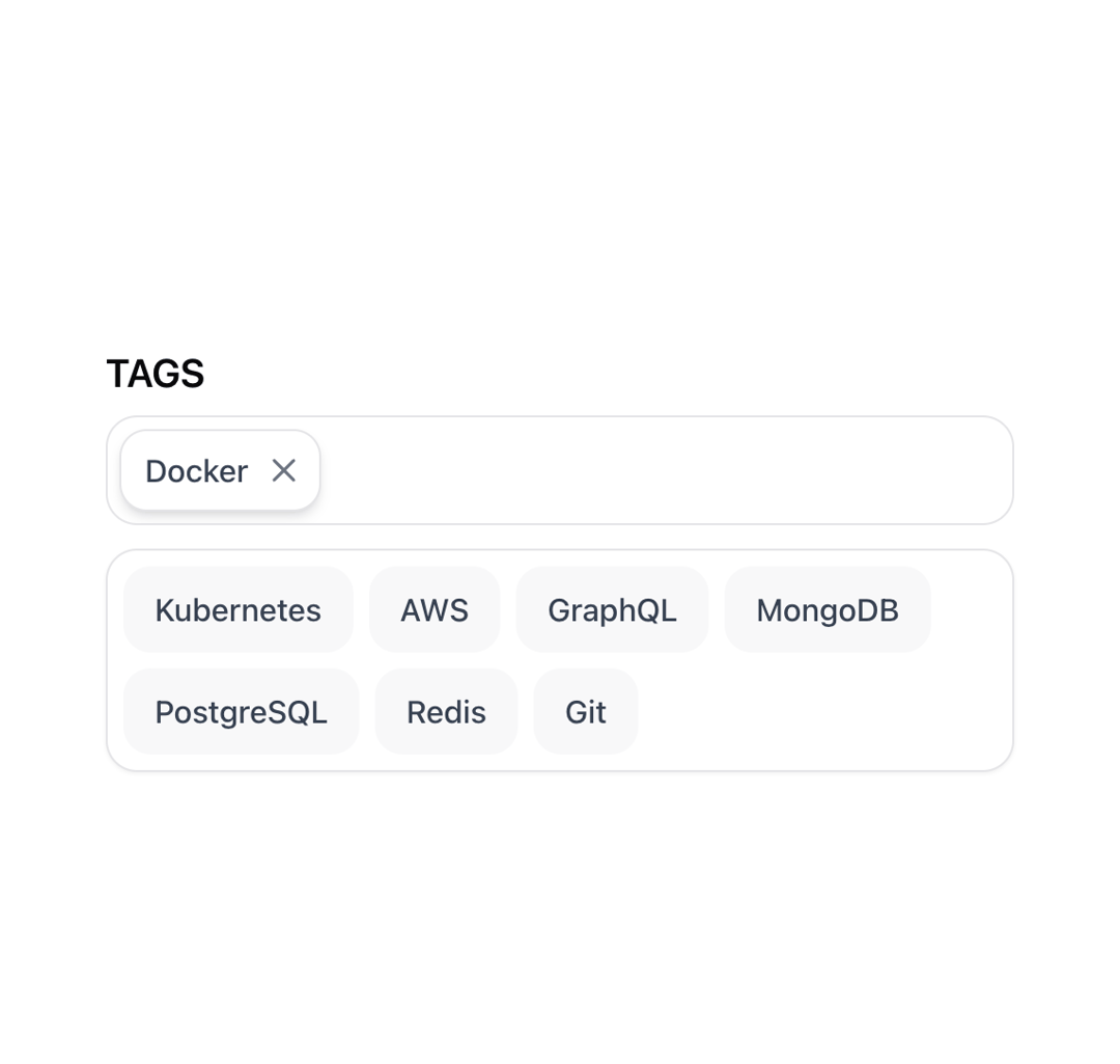
The Tags Selector component is a reusable UI element for selecting and managing tags from a predefined list.
Built with React and Tailwind. Copy the prompt and paste it into Claude Code, Cursor or Lovable: your agent adds Tags Selector to your project and fits it to your theme.
Code
How Tags Selector is used: the demo's code. The component's own source comes with a free account.
Usage.tsx
import { TagsSelector } from "@/components/ui/tags-selector";

const TAGS = [
  { id: "docker", label: "Docker" },
  { id: "kubernetes", label: "Kubernetes" },
  { id: "aws", label: "AWS" },
  { id: "graphql", label: "GraphQL" },
  { id: "mongodb", label: "MongoDB" },
  { id: "postgresql", label: "PostgreSQL" },
  { id: "redis", label: "Redis" },
  { id: "git", label: "Git" },
];

const TagsSelectorDemo = () => (
  <div style={{ padding: "20px", maxWidth: "600px", width: "100%" }}>
    <TagsSelector tags={TAGS} />
  </div>
);

export default { TagsSelectorDemo };
Dependencies
More by LN
View all
Pricing Interaction
1.4K
Dorpdown Navigation
1.3K
Visualize Booking
628
Assisted Password Confirmation
597
Mega Menu
399
Feedback Slider
329
FlipButton
293
Dynamic Action
228
More in Forms
View all

Contact Card
1K

Premium Auth
525

Login 2
8

Form
16

Card Studio
41

HeroUI Field Error
10

Book A Demo 1
74
Book A Demo 3
90