
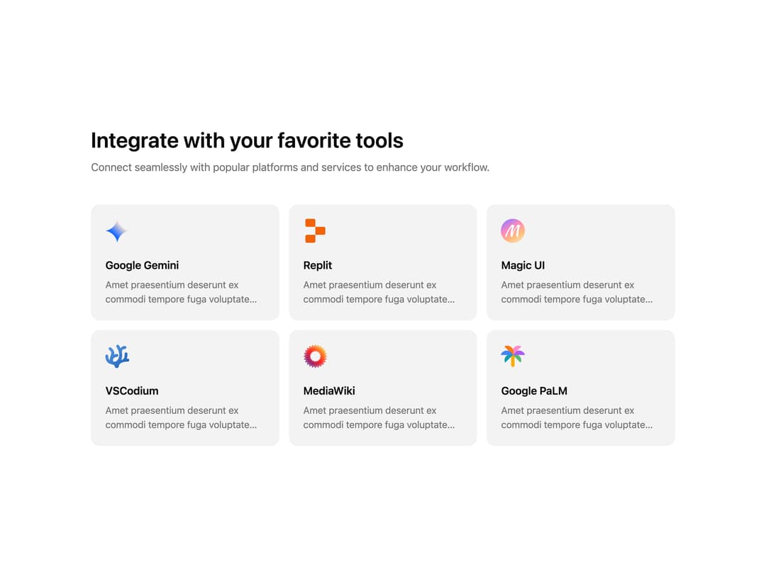
About
A marketing section that showcases third-party integrations as a responsive grid of logo cards with title and description.
Built with React and Tailwind. Copy the prompt and paste it into Claude Code, Cursor or Lovable: your agent adds Integrations Card Grid to your project and fits it to your theme.
Code
How Integrations Card Grid is used: the demo's code. The component's own source comes with a free account.
Usage.tsx
import Integrations from "@/components/ui/integrations-three";

export default function IntegrationsDemo() {
  return (
    <div className="bg-background text-foreground">
      <Integrations />
    </div>
  );
}
More by Méschac Irung
View all

Features 8
3.1K
Hero Section 1
3K
Hero Section 5
2.6K
Hero Section 6
902
Hero Section 2
876
Hero Section 4
626
Features 9
605
Integrations Section
592
More in Features
View all

Feature Sections
40

Grid Feature Cards
1.9K
Feature with advantages
284
Features Card
217
Features 2
325

Features Grid
80
Features 4
376

Feature 1
118

