
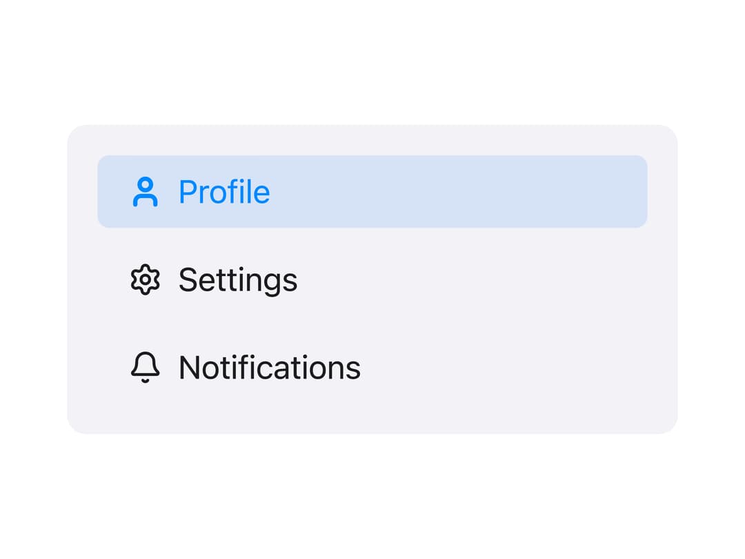
About
A selectable navigation button used as a row inside a collapsible side panel, supporting an active state and an optional leading icon that reacts to selection.
Built with React and Tailwind. Copy the prompt and paste it into Claude Code, Cursor or Lovable: your agent adds Side Panel Item to your project and fits it to your theme.
Code
How Side Panel Item is used: the demo's code. The component's own source comes with a free account.
Usage.tsx
"use client";

import MSidePanelItem from "@/components/ui/mside-panel-item";
import { User, Settings, Bell } from "lucide-react";
import * as React from "react";

export default function MSidePanelItemDemo() {
  const [current, setCurrent] = React.useState("profile");

  return (
    <div
      className="flex w-full max-w-xs flex-col gap-2 rounded-lg p-4"
      style={{ background: "rgb(242,242,247)" }}
    >
      <MSidePanelItem
        id="profile"
        label="Profile"
        active={current === "profile"}
        onSelect={setCurrent}
        icon={({ active }) => <User strokeWidth={active ? 3 : 2} size={18} />}
      />
      <MSidePanelItem
        id="settings"
        label="Settings"
        active={current === "settings"}
        onSelect={setCurrent}
        icon={({ active }) => (
          <Settings strokeWidth={active ? 3 : 2} size={18} />
        )}
      />
      <MSidePanelItem
        id="notifications"
        label="Notifications"
        active={current === "notifications"}
        onSelect={setCurrent}
        icon={({ active }) => <Bell strokeWidth={active ? 3 : 2} size={18} />}
      />
    </div>
  );
}
Dependencies
More by millaistudio
View all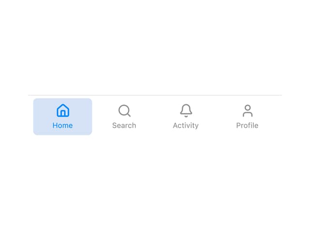
Tab Bar Item
2
MCheckbox
1
M Button
MListItem
MBadge
MCard
MText Input
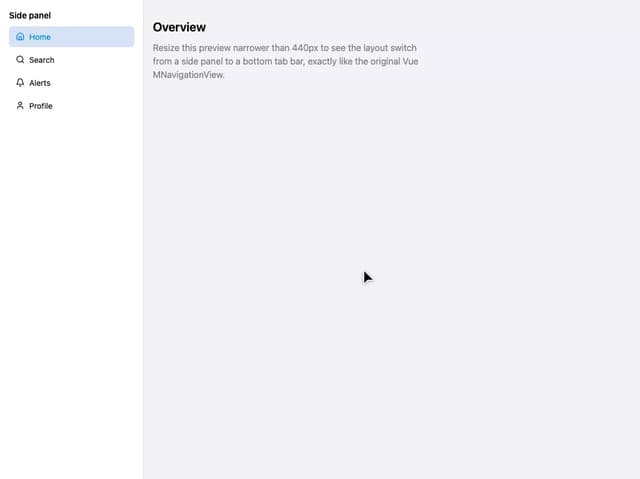
Navigation View
More in Navigation
View all

Sidebar
297

Progress Bar Stepper
45
Navbar
1
Tabs
16
Breadcrumb
103

Capsule Tabs
21
Pagination
27
Pagination with Ellipsis
18
