
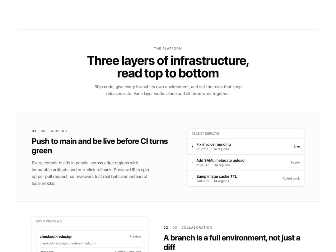
About
A bordered feature block for marketing pages that pairs a centered intro with alternating text/media rows, a three-column primitives grid, and call-to-action buttons.
Built with React and Tailwind. Copy the prompt and paste it into Claude Code, Cursor or Lovable: your agent adds Layered Feature Section to your project and fits it to your theme.
Code
How Layered Feature Section is used: the demo's code. The component's own source comes with a free account.
Usage.tsx
import Feature01 from "@/components/ui/feature-01";

export default function Feature01Demo() {
  return <Feature01 />;
}
Dependencies
More by Mohammad Shehadeh
View all
Feature Problem Cards
91
Feature Grid Spotlight Cards
74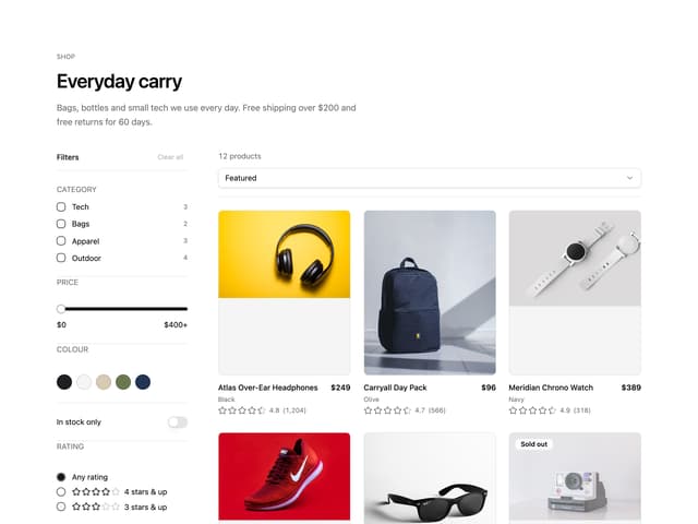
Ecommerce Category Page
73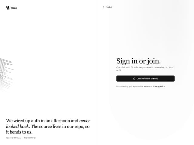
Split Login
70
Comparison Section
66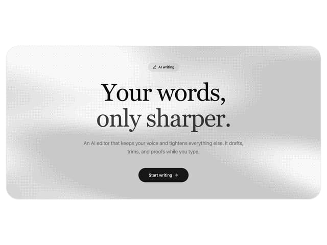
Dithered Shader CTA
65
Comparison Table
64
FAQ Two Column
64
More in Features
View all

Feature Sections
40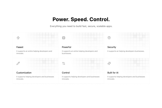

Grid Feature Cards
1.9K

Features 8
3.1K
Feature with advantages
284
Features Card
217
Features 2
325

Features Grid
80
Features 4
376

