
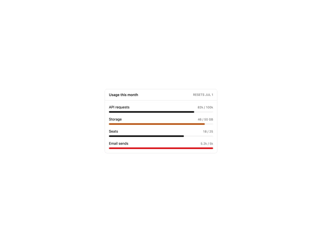
About
Metered usage panel with per-resource progress bars that tint amber near the limit and red over it. Ships composable parts.
Built with React and Tailwind. Copy the prompt and paste it into Claude Code, Cursor or Lovable: your agent adds Usage Dashboard to your project and fits it to your theme.
Code
How Usage Dashboard is used: the demo's code. The component's own source comes with a free account.
Usage.tsx
import UsageDashboardBlock from "@/components/ui/usage-dashboard";

export default function UsageDashboardDemo() {
  return <UsageDashboardBlock />;
}
More by Mohammad Shehadeh
View all
Feature Problem Cards
91
Feature Grid Spotlight Cards
74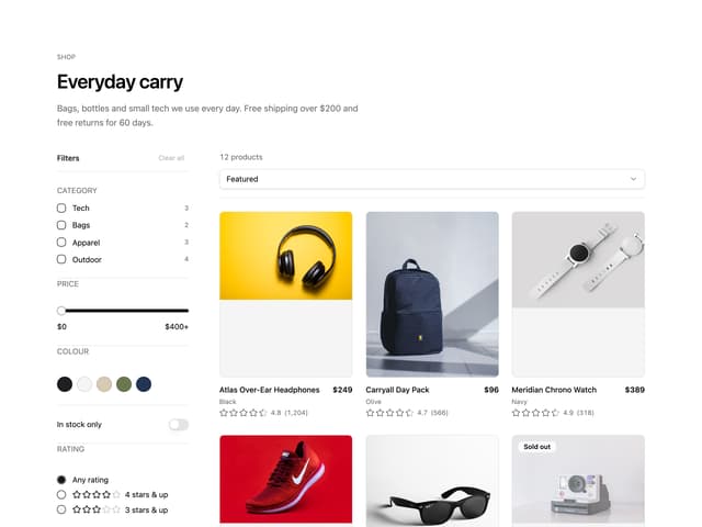
Ecommerce Category Page
73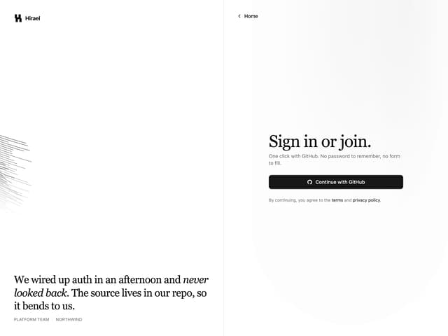
Split Login
70
Comparison Section
66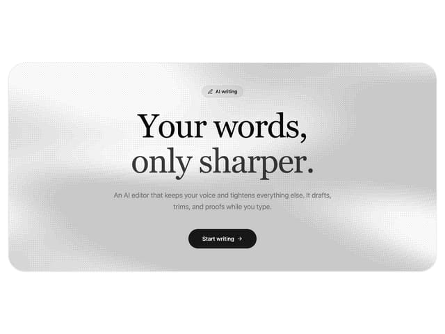
Dithered Shader CTA
65
Comparison Table
64
FAQ Two Column
64
More in Dashboards
View all
Dashboard with Collapsible Sidebar
2.5K

Sidebar
294
Bar Chart
1

SaaS Template
2.5K

System Status Block
316

Course Design Cards
1.1K

Chat template
617
Stats Bento
1.1K


