
About
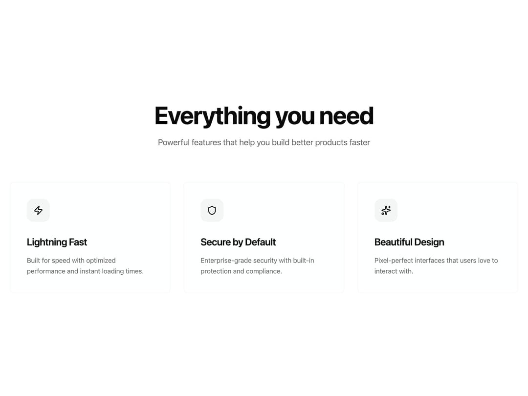
A responsive three-column grid of feature cards with icons, glassmorphism backdrop blur, and hover scale effects for product landing pages.
Built with React and Tailwind. Copy the prompt and paste it into Claude Code, Cursor or Lovable: your agent adds Feature Cards Grid to your project and fits it to your theme.
Code
How Feature Cards Grid is used: the demo's code. The component's own source comes with a free account.
Usage.tsx
import { FeatureCardsBlockBaseui } from "@/components/ui/feature-cards-block-baseui";

export default function Default() {
  return <FeatureCardsBlockBaseui />;
}
Dependencies
More by Moumen Soliman
View all
Interactive Logs Table
1.4K
Glass Blog Card
1.1K
Glowy Waves Hero
927
Gallery Grid with Lightbox
804
Expanding Search Dock
767
Glassmorphism Portfolio
661
Hero Section
607
Glass Checkout Card
489
More in Features
View all

Feature Sections
40

Grid Feature Cards
1.9K
Feature with advantages
284

Features 8
3.1K
Features Card
216

Features Grid
80
Features 2
325
Features 4
375

