About
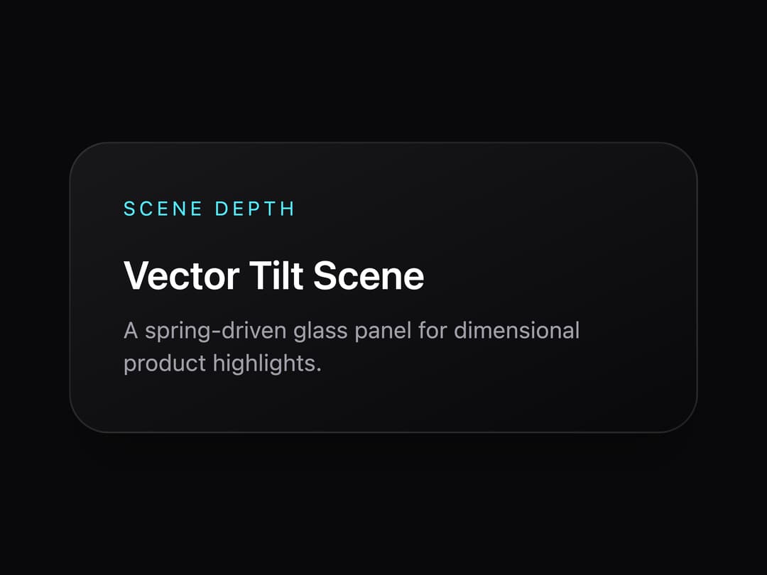
A spring-driven 3D tilt glass panel that follows the cursor, for hero cards and feature highlights.
Built with React and Tailwind. Copy the prompt and paste it into Claude Code, Cursor or Lovable: your agent adds Vector Tilt Scene to your project and fits it to your theme.
Code
How Vector Tilt Scene is used: the demo's code. The component's own source comes with a free account.
Usage.tsx
import { VectorTiltScene } from "@/components/ui/vector-tilt-scene";

export default function Default() {
  return (
    <div className="flex min-h-[420px] w-full items-center justify-center bg-zinc-950 p-10">
      <div className="w-full max-w-sm">
        <VectorTiltScene />
      </div>
    </div>
  );
}
Dependencies
More by nexus-ui
View all
Circular Carousel
1.2K
Images Badge
980
Chat Messages
328
Shooting Stars Grid
157
Infinite Moving Cards
156
Cinematic Logo Cloud
156
Logo Clouds
106
Image Trail
90
More in Cards
View all

Course Design Cards
1.1K

Interactive Tech Stack Bento Grid with Hover Effects
223
Stats cards with links
84

Statistics Card 7
301

Card Studio
10
Statistics Card 2
276

Weather Card
59
Card
56
