About
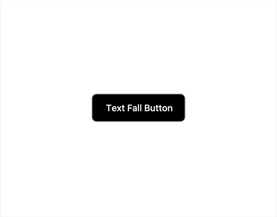
A button whose label characters drop and settle into place with an elastic GSAP animation on hover, click, or page load.
Built with React and Tailwind. Copy the prompt and paste it into Claude Code, Cursor or Lovable: your agent adds Text Fall Button to your project and fits it to your theme.
Code
How Text Fall Button is used: the demo's code. The component's own source comes with a free account.
Usage.tsx
import { TextFallButton } from "@/components/ui/text-fall-button";

export default function TextFallButtonDemo() {
  return (
    <div className="flex h-screen w-full items-center justify-center bg-background">
      <TextFallButton className="relative overflow-hidden rounded-md bg-black px-6 py-3 text-base font-medium text-white">
        Text Fall Button
      </TextFallButton>
    </div>
  );
}
Dependencies
More by Pace UI
View all

Dot Loader
919
Flip Reveal
642
Dot Flow
259
Draw Line Text
111
Liquid Glass
55
Liquid Cursor
43
Layered Stack
35
Reveal Text
8
More in Buttons
View all
Texture Button
98

Button
1
Button
68

Button
65

Eclipse Button
3
Base Button
4

HeroUI Button Group
2

App Store Button
459

