
About
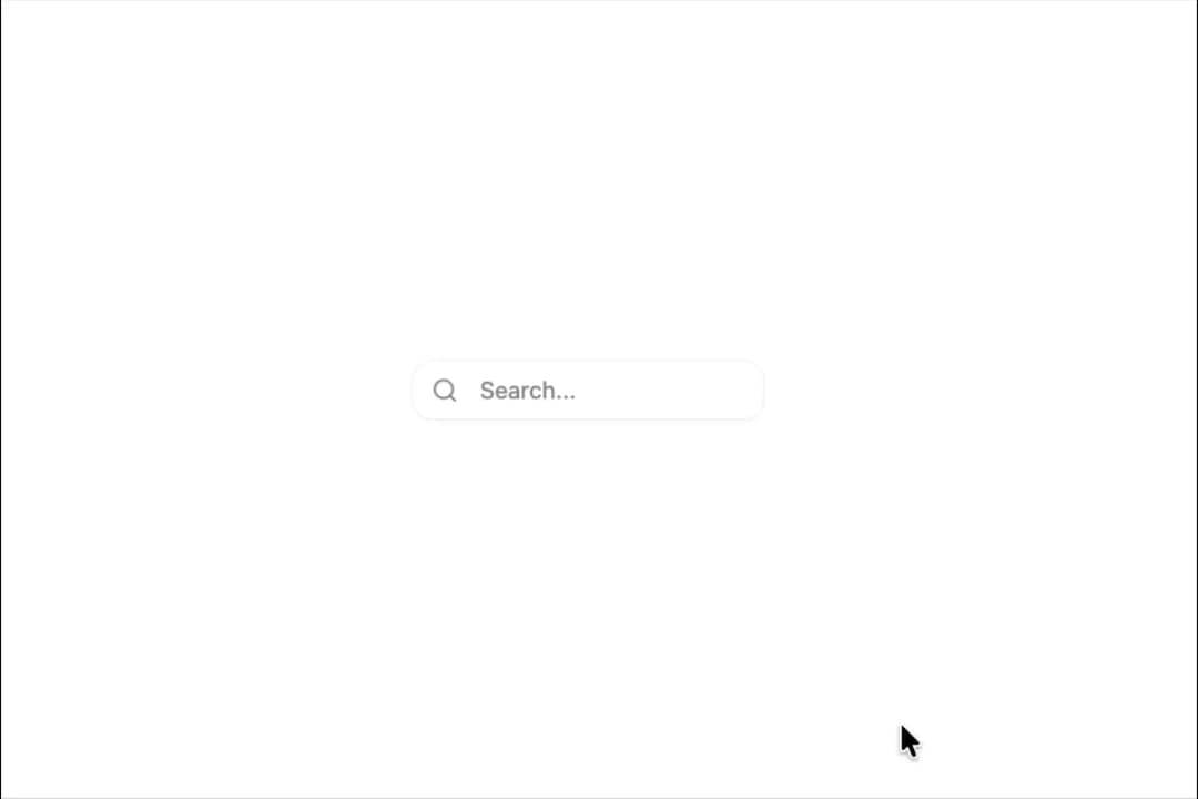
Displays a form input field with enhanced features like password visibility toggle, clearable functionality, and Zod validation support.
Built with React and Tailwind. Copy the prompt and paste it into Claude Code, Cursor or Lovable: your agent adds Input to your project and fits it to your theme.
Code
How Input is used: the demo's code. The component's own source comes with a free account.
Usage.tsx
import { Input } from "@/components/ui/input";
import { Search, User, Mail } from "lucide-react";

export default function DemoOne() {
  return (
    <>
      <div>
        <Input
          placeholder="Search..."
          leftIcon={<Search />}
          clearable
        />
      </div>
    </>
  );
}
Dependencies
More by Preet Suthar
View all

Modern & Stunning sign in
1.6K
Shining Text
1.6K
Magic Text
861
Toolbar
838
Hero 2
826
Typewriter Text
788
Full Screen Signup
753
AI Chat Input
751
More in Forms
View all

Premium Auth
525

Contact Card
1K

Login 2
8

Card Studio
41

Book A Demo 1
74

HeroUI Field Error
10

Form
16
Book A Demo 3
90